Choropleth mapping involves the symbolisation of enumeration units, such as countries, provinces, states, counties or census units, using area patterns or graduated colors. For example, a social scientist may need to use a choropleth map to portray the spatial distribution of aged population of Singapore by Master Plan 2014 Subzone Boundary.
In this chapter, you will learn how to plot functional and truthful choropleth maps by using an R package called tmap package.
In this hands-on exercise, the key R package use is tmap package in R. Beside tmap package, four other R packages will be used. They are:
readr for importing delimited text file,
tidyr for tidying data,
dplyr for wrangling data and
sf for handling geospatial data.
Among the four packages, readr, tidyr and dplyr are part of tidyverse package.
The code chunk below will be used to install and load these packages in RStudio.
pacman::p_load(sf, tmap, tidyverse)Two data set will be used to create the choropleth map. They are:
Master Plan 2014 Subzone Boundary (Web) (i.e.
MP14_SUBZONE_WEB_PL) in ESRI shapefile format. It can be downloaded at data.gov.sg This is a geospatial data. It consists of the geographical boundary of Singapore at the planning subzone level. The data is based on URA Master Plan 2014.Singapore Residents by Planning Area / Subzone, Age Group, Sex and Type of Dwelling, June 2011-2020 in csv format (i.e.
respopagesextod2011to2020.csv). This is an aspatial data fie. It can be downloaded at Department of Statistics, Singapore Although it does not contain any coordinates values, but it’s PA and SZ fields can be used as unique identifiers to geocode toMP14_SUBZONE_WEB_PLshapefile.
The code chunk below uses the st_read() function of sf package to import MP14_SUBZONE_WEB_PL shapefile into R as a simple feature data frame called mpsz.
mpsz <- st_read(dsn = "data/geospatial",
                layer = "MP14_SUBZONE_WEB_PL")
Reading layer `MP14_SUBZONE_WEB_PL' from data source
`C:\Users\jia_y\OneDrive - Singapore Management University\Semester 6\ISSS608 VAA\jylau91\ISSS608-VAA\L8\data\geospatial'
using driver `ESRI Shapefile'
Simple feature collection with 323 features and 15 fields
Geometry type: MULTIPOLYGON
Dimension: XY
Bounding box: xmin: 2667.538 ymin: 15748.72 xmax: 56396.44 ymax: 50256.33
Projected CRS: SVY21We can call the variable loaded “mpsz” to view the shapefile, only 10 rows are displayed as sf package uses tibble to represent simple feature data.
print(mpsz)Simple feature collection with 323 features and 15 fields
Geometry type: MULTIPOLYGON
Dimension: XY
Bounding box: xmin: 2667.538 ymin: 15748.72 xmax: 56396.44 ymax: 50256.33
Projected CRS: SVY21
First 10 features:
OBJECTID SUBZONE_NO SUBZONE_N SUBZONE_C CA_IND PLN_AREA_N
1 1 1 MARINA SOUTH MSSZ01 Y MARINA SOUTH
2 2 1 PEARL'S HILL OTSZ01 Y OUTRAM
3 3 3 BOAT QUAY SRSZ03 Y SINGAPORE RIVER
4 4 8 HENDERSON HILL BMSZ08 N BUKIT MERAH
5 5 3 REDHILL BMSZ03 N BUKIT MERAH
6 6 7 ALEXANDRA HILL BMSZ07 N BUKIT MERAH
7 7 9 BUKIT HO SWEE BMSZ09 N BUKIT MERAH
8 8 2 CLARKE QUAY SRSZ02 Y SINGAPORE RIVER
9 9 13 PASIR PANJANG 1 QTSZ13 N QUEENSTOWN
10 10 7 QUEENSWAY QTSZ07 N QUEENSTOWN
PLN_AREA_C REGION_N REGION_C INC_CRC FMEL_UPD_D X_ADDR
1 MS CENTRAL REGION CR 5ED7EB253F99252E 2014-12-05 31595.84
2 OT CENTRAL REGION CR 8C7149B9EB32EEFC 2014-12-05 28679.06
3 SR CENTRAL REGION CR C35FEFF02B13E0E5 2014-12-05 29654.96
4 BM CENTRAL REGION CR 3775D82C5DDBEFBD 2014-12-05 26782.83
5 BM CENTRAL REGION CR 85D9ABEF0A40678F 2014-12-05 26201.96
6 BM CENTRAL REGION CR 9D286521EF5E3B59 2014-12-05 25358.82
7 BM CENTRAL REGION CR 7839A8577144EFE2 2014-12-05 27680.06
8 SR CENTRAL REGION CR 48661DC0FBA09F7A 2014-12-05 29253.21
9 QT CENTRAL REGION CR 1F721290C421BFAB 2014-12-05 22077.34
10 QT CENTRAL REGION CR 3580D2AFFBEE914C 2014-12-05 24168.31
Y_ADDR SHAPE_Leng SHAPE_Area geometry
1 29220.19 5267.381 1630379.3 MULTIPOLYGON (((31495.56 30...
2 29782.05 3506.107 559816.2 MULTIPOLYGON (((29092.28 30...
3 29974.66 1740.926 160807.5 MULTIPOLYGON (((29932.33 29...
4 29933.77 3313.625 595428.9 MULTIPOLYGON (((27131.28 30...
5 30005.70 2825.594 387429.4 MULTIPOLYGON (((26451.03 30...
6 29991.38 4428.913 1030378.8 MULTIPOLYGON (((25899.7 297...
7 30230.86 3275.312 551732.0 MULTIPOLYGON (((27746.95 30...
8 30222.86 2208.619 290184.7 MULTIPOLYGON (((29351.26 29...
9 29893.78 6571.323 1084792.3 MULTIPOLYGON (((20996.49 30...
10 30104.18 3454.239 631644.3 MULTIPOLYGON (((24472.11 29...#print (mpsz, n = 20) for more rows.Next, we will import respopagsex2011to2020.csv file into RStudio and save the file into an R dataframe called popagsex.
The task will be performed by using read_csv() function of readr package as shown in the code chunk below.
popdata <- read_csv("data/aspatial/respopagesextod2011to2020.csv")Before a thematic map can be prepared, you are required to prepare a data table with year 2020 values. The data table should include the variables PA, SZ, YOUNG, ECONOMY ACTIVE, AGED, TOTAL, DEPENDENCY.
YOUNG: age group 0 to 4 until age groyup 20 to 24,
ECONOMY ACTIVE: age group 25-29 until age group 60-64,
AGED: age group 65 and above,
TOTAL: all age group, and
DEPENDENCY: the ratio between young and aged against economy active group
The following data wrangling and transformation functions will be used:
pivot_wider() of tidyr package, and
mutate(), filter(), group_by() and select() of dplyr package
popdata2020 <- popdata %>%
  filter(Time == 2020) %>%
  group_by(PA, SZ, AG) %>%
  summarise(`POP` = sum(`Pop`)) %>%
  ungroup() %>%
  pivot_wider(names_from=AG,
              values_from=POP) %>%
  mutate(YOUNG = rowSums(.[3:6])
         +rowSums(.[12])) %>%
mutate(`ECONOMY ACTIVE` = rowSums(.[7:11])+
rowSums(.[13:15]))%>%
mutate(`AGED`=rowSums(.[16:21])) %>%
mutate(`TOTAL`=rowSums(.[3:21])) %>%
mutate(`DEPENDENCY` = (`YOUNG` + `AGED`)
/`ECONOMY ACTIVE`) %>%
  select(`PA`, `SZ`, `YOUNG`,
       `ECONOMY ACTIVE`, `AGED`,
       `TOTAL`, `DEPENDENCY`)
Before we can perform the georelational join, one extra step is required to convert the values in PA and SZ fields to uppercase. This is because the values of PA and SZ fields are made up of upper- and lowercase. On the other, hand the SUBZONE_N and PLN_AREA_N are in uppercase.
popdata2020 <- popdata2020 %>%
  mutate(across(c(PA, SZ), toupper)) %>%
  filter(`ECONOMY ACTIVE` > 0)
Next, left_join() of dplyr is used to join the geographical data and attribute table using planning subzone name e.g. SUBZONE_N and SZ as the common identifier.
mpsz_pop2020 <- left_join(mpsz, popdata2020,
                          by = c("SUBZONE_N" = "SZ"))
Thing to learn from the code chunk above:
- left_join() of dplyr package is used with
mpszsimple feature data frame as the left data table is to ensure that the output will be a simple features data frame.
write_rds(mpsz_pop2020, "data/rds/mpszpop2020.rds")Two approaches can be used to prepare thematic map using tmap, they are:
Plotting a thematic map quickly by using qtm().
Plotting highly customisable thematic map by using tmap elements.
The easiest and quickest to draw a choropleth map using tmap is using qtm(). It is concise and provides a good default visualisation in many cases.
The code chunk below will draw a cartographic standard choropleth map as shown below.
tmap_mode("plot")
qtm(mpsz_pop2020,
    fill = "DEPENDENCY")
Things to learn from the code chunk above:
tmap_mode() with “plot” option is used to produce a static map. For interactive mode, “view” option should be used.
fill argument is used to map the attribute (i.e. DEPENDENCY)
Despite its usefulness of drawing a choropleth map quickly and easily, the disadvantge of qtm() is that it makes aesthetics of individual layers harder to control. To draw a high quality cartographic choropleth map as shown in the figure below, tmap’s drawing elements should be used.
tm_shape(mpsz_pop2020)+
  tm_polygons(fill = "DEPENDENCY",
              fill.scale = tm_scale_intervals(
                style = "quantile",
                n = 5,
                values = "brewer.blues"),
              fill.legend = tm_legend(
                title = "Dependency ratio")) +
  tm_title("Distribution of Dependency Ratio by planning subzone") +
  tm_layout(frame = TRUE) +
  tm_borders(fill_alpha = 0.5) +
  tm_compass(type="8star", size = 2) +
  tm_grid(alpha =0.2) +
  tm_credits("Source: Planning Sub-zone boundary from Urban Redevelopment Authorithy (URA)\n and Population data from Department of Statistics DOS",
             position = c("left", "bottom"))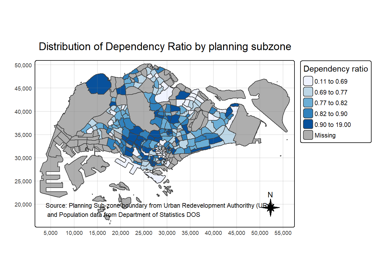
In the following sub-section, we will share with you tmap functions that used to plot these elements.
The basic building block of tmap is tm_shape() followed by one or more layer elemments such as tm_fill() and tm_polygons().
In the code chunk below, tm_shape() is used to define the input data (i.e mpsz_pop2020) and tm_polygons() is used to draw the planning subzone polygons
tm_shape(mpsz_pop2020) +
  tm_polygons()
To draw a choropleth map showing the geographical distribution of a selected variable by planning subzone, we just need to assign the target variable such as Dependency to tm_polygons().
tm_shape(mpsz_pop2020)+
  tm_polygons("DEPENDENCY")
Things to learn from tm_polygons():
The default interval binning used to draw the choropleth map is called “pretty”. A detailed discussion of the data classification methods supported by tmap will be provided in sub-section 4.3.
The default colour scheme used is
YlOrRdof ColorBrewer. You will learn more about the color scheme in sub-section 4.4.By default, Missing value will be shaded in grey.
Actually, tm_polygons() is a wraper of tm_fill() and tm_border(). tm_fill() shades the polygons by using the default colour scheme and tm_borders() adds the borders of the shapefile onto the choropleth map.
The code chunk below draws a choropleth map by using tm_fill() alone.
tm_shape(mpsz_pop2020)+
  tm_fill("DEPENDENCY")
Notice that the planning subzones are shared according to the respective dependecy values
To add the boundary of the planning subzones, tm_borders will be used as shown in the code chunk below.
tm_shape(mpsz_pop2020)+
  tm_polygons(fill = "DEPENDENCY") +
  tm_borders(lwd = 0.01,
             fill_alpha = 0.1)
Notice that light-gray border lines have been added on the choropleth map.
The alpha argument is used to define transparency number between 0 (totally transparent) and 1 (not transparent). By default, the alpha value of the col is used (normally 1).
Beside alpha argument, there are three other arguments for tm_borders(), they are:
col = border colour,
lwd = border line width. The default is 1, and
lty = border line type. The default is “solid”.
Most choropleth maps employ some methods of data classification. The point of classification is to take a large number of observations and group them into data ranges or classes.
tmap provides a total ten data classification methods, namely: fixed, sd, equal, pretty (default), quantile, kmeans, hclust, bclust, fisher, and jenks.
To define a data classification method, the style argument of tm_fill() or tm_polygons() will be used.
The code chunk below shows a quantile data classification that used 5 classes.
tm_shape(mpsz_pop2020)+
  tm_polygons("DEPENDENCY",
      fill.scale = tm_scale_intervals(
        style = "jenks",
        n = 5)) +
  tm_borders(fill_alpha = 0.5)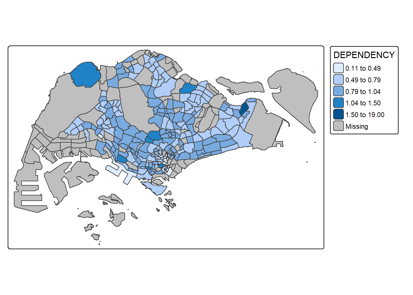
In the code chunk below, equal data classification method is used.
tm_shape(mpsz_pop2020)+
  tm_polygons("DEPENDENCY",
      fill.scale = tm_scale_intervals(
        style = "equal",
        n = 5)) +
  tm_borders(fill_alpha = 0.5)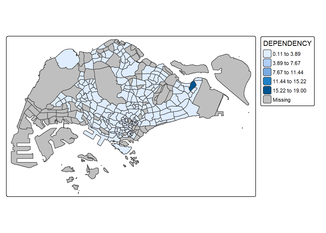
Notice that the distribution of quantile data classification method are more evenly distributed then equal data classification method.
# Set tmap to plotting mode
tmap_mode("plot")

# Pretty (default)
tm_shape(mpsz_pop2020) +
  tm_polygons("DEPENDENCY", style = "pretty", n = 5) +
  tm_borders() +
  tm_layout(title = "Pretty Classification")
# Quantile
tm_shape(mpsz_pop2020) +
  tm_polygons("DEPENDENCY", style = "quantile", n = 5) +
  tm_borders() +
  tm_layout(title = "Quantile Classification")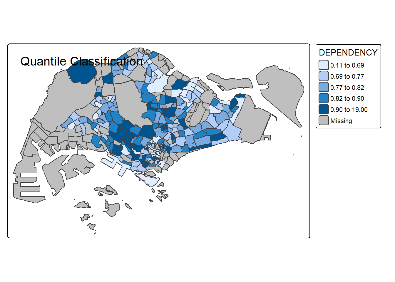
# Equal Interval
tm_shape(mpsz_pop2020) +
  tm_polygons("DEPENDENCY", style = "equal", n = 5) +
  tm_borders() +
  tm_layout(title = "Equal Interval Classification")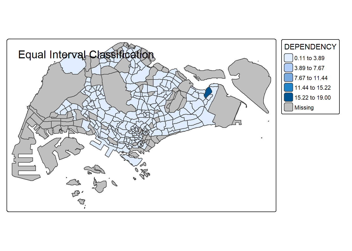
# Jenks (Natural Breaks)
tm_shape(mpsz_pop2020) +
  tm_polygons("DEPENDENCY", style = "jenks", n = 5) +
  tm_borders() +
  tm_layout(title = "Jenks (Natural Breaks) Classification")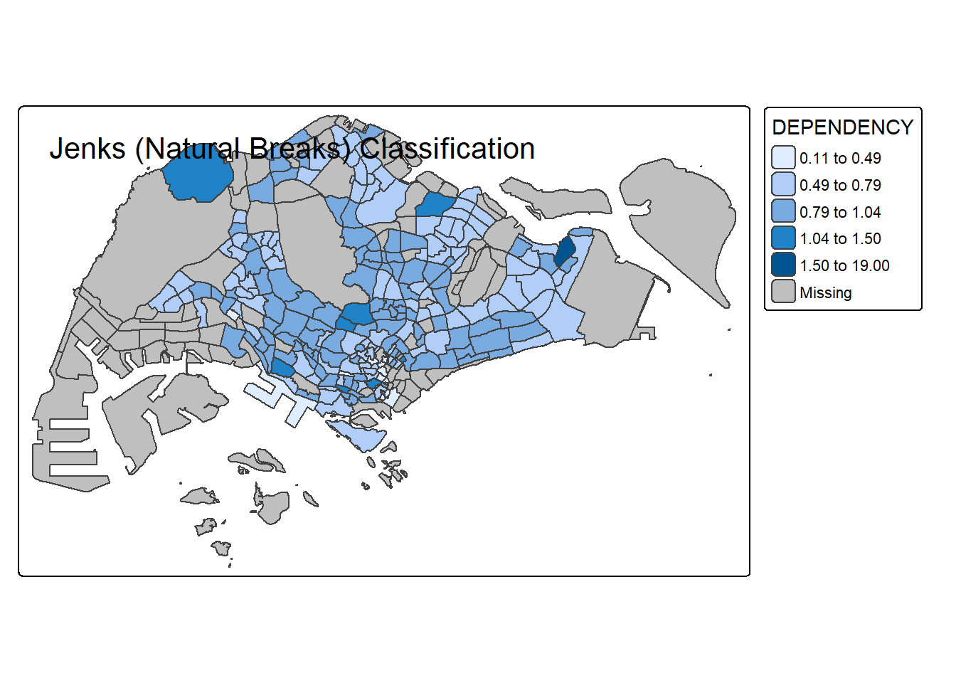
# Standard Deviation
tm_shape(mpsz_pop2020) +
  tm_polygons("DEPENDENCY", style = "sd", n = 5) +
  tm_borders() +
  tm_layout(title = "Standard Deviation Classification")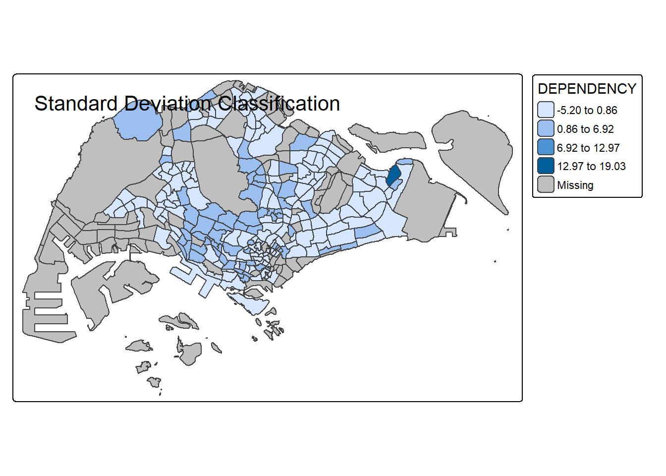
# 2 classes
tm_shape(mpsz_pop2020) +
  tm_polygons("DEPENDENCY", style = "quantile", n = 2) +
  tm_borders() +
  tm_layout(title = "Quantile, 2 Classes")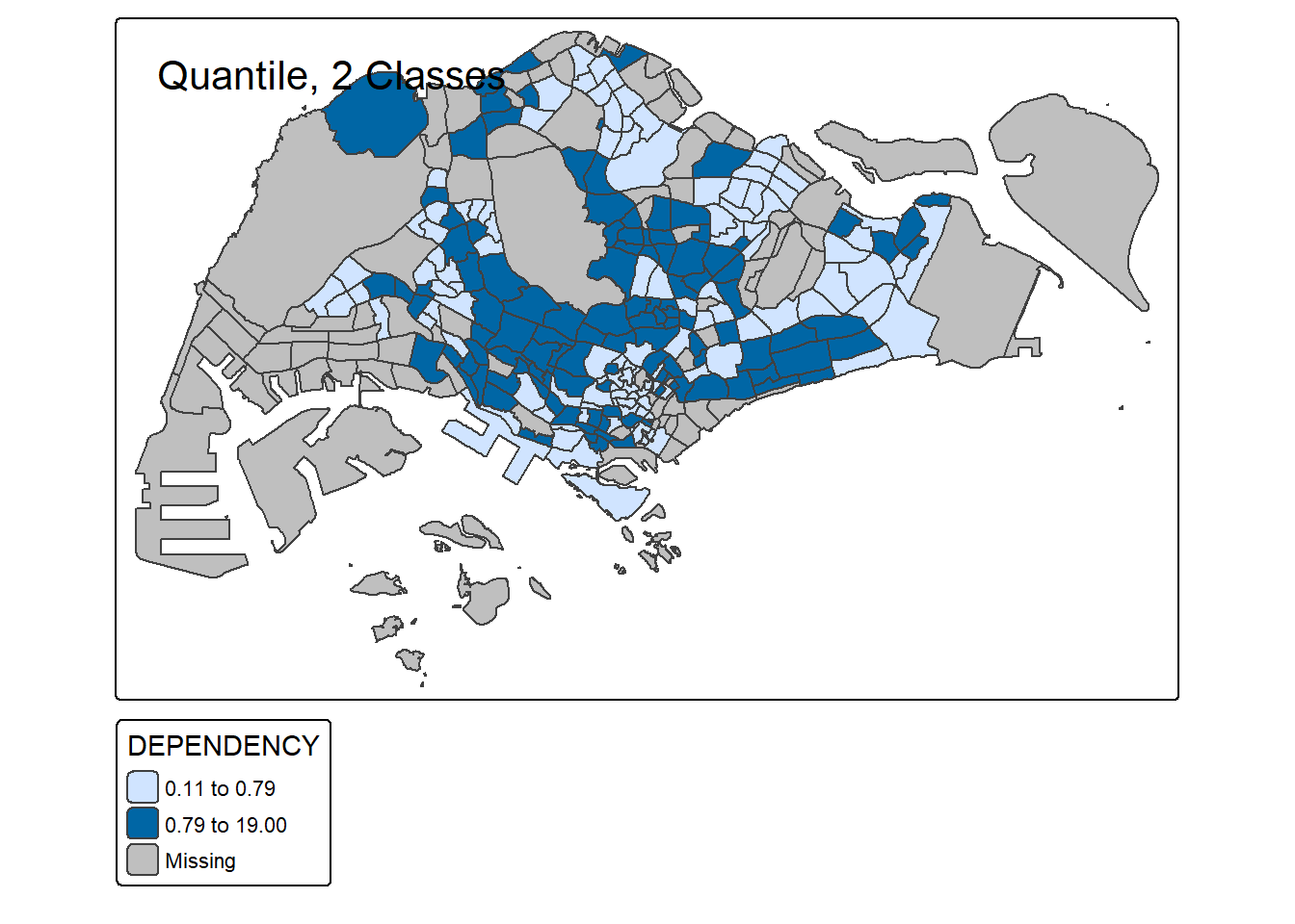
# 6 classes
tm_shape(mpsz_pop2020) +
  tm_polygons("DEPENDENCY", style = "quantile", n = 6) +
  tm_borders() +
  tm_layout(title = "Quantile, 6 Classes")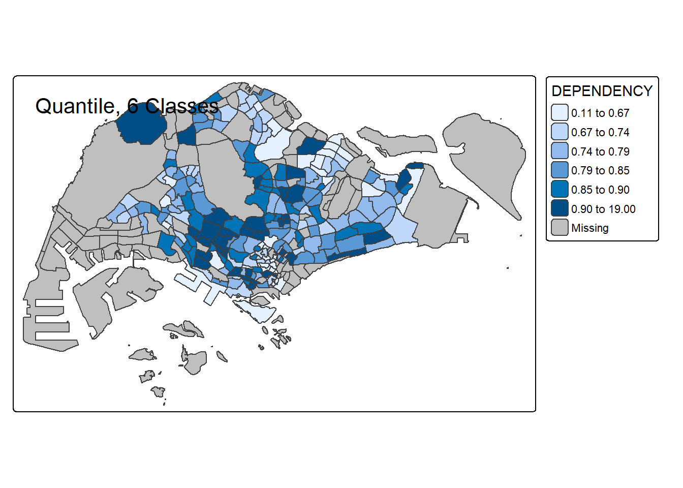
# 10 classes
tm_shape(mpsz_pop2020) +
  tm_polygons("DEPENDENCY", style = "quantile", n = 10) +
  tm_borders() +
  tm_layout(title = "Quantile, 10 Classes")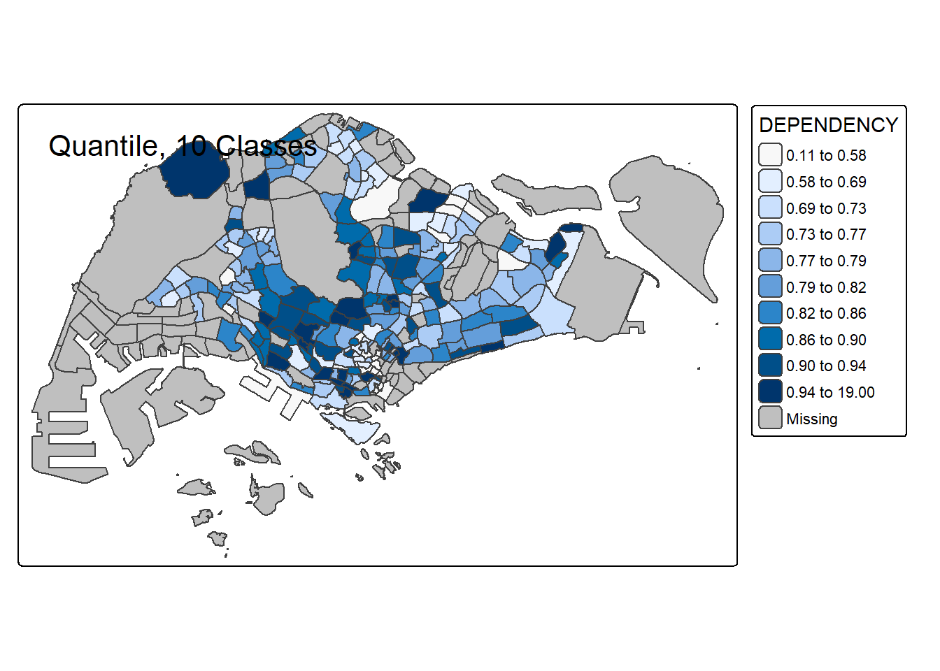
# 20 classes
tm_shape(mpsz_pop2020) +
  tm_polygons("DEPENDENCY", style = "quantile", n = 20) +
  tm_borders() +
  tm_layout(title = "Quantile, 20 Classes")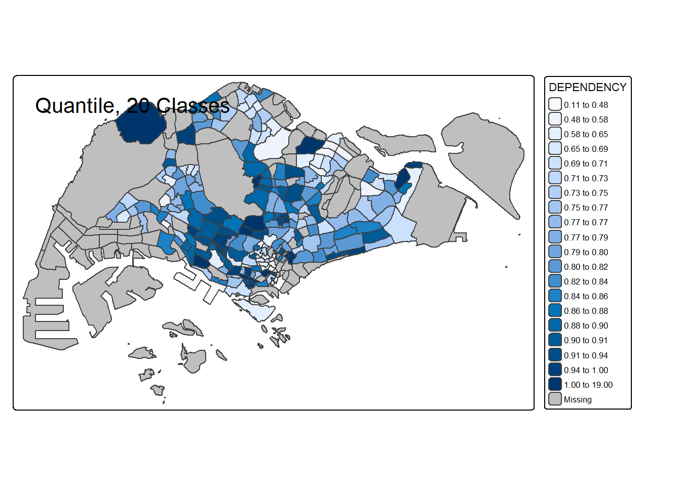
For all the built-in styles, the category breaks are computed internally. In order to override these defaults, the breakpoints can be set explicitly by means of the breaks argument to the tm_fill(). It is important to note that, in tmap the breaks include a minimum and maximum. As a result, in order to end up with n categories, n+1 elements must be specified in the breaks option (the values must be in increasing order).
Before we get started, it is always a good practice to get some descriptive statistics on the variable before setting the break points. Code chunk below will be used to compute and display the descriptive statistics of DEPENDENCY field.
summary(mpsz_pop2020$DEPENDENCY) Min. 1st Qu. Median Mean 3rd Qu. Max. NA's
0.1111 0.7147 0.7866 0.8585 0.8763 19.0000 92 With reference to the results above, we set break point at 0.60, 0.70, 0.80, and 0.90. In addition, we also need to include a minimum and maximum, which we set at 0 and 100. Our breaks vector is thus c(0, 0.60, 0.70, 0.80, 0.90, 1.00)
Now, we will plot the choropleth map by using the code chunk below.
tm_shape(mpsz_pop2020)+
  tm_polygons("DEPENDENCY",
          breaks = c(0, 0.60, 0.70, 0.80, 0.90, 1.00)) +
  tm_borders(fill_alpha = 0.5)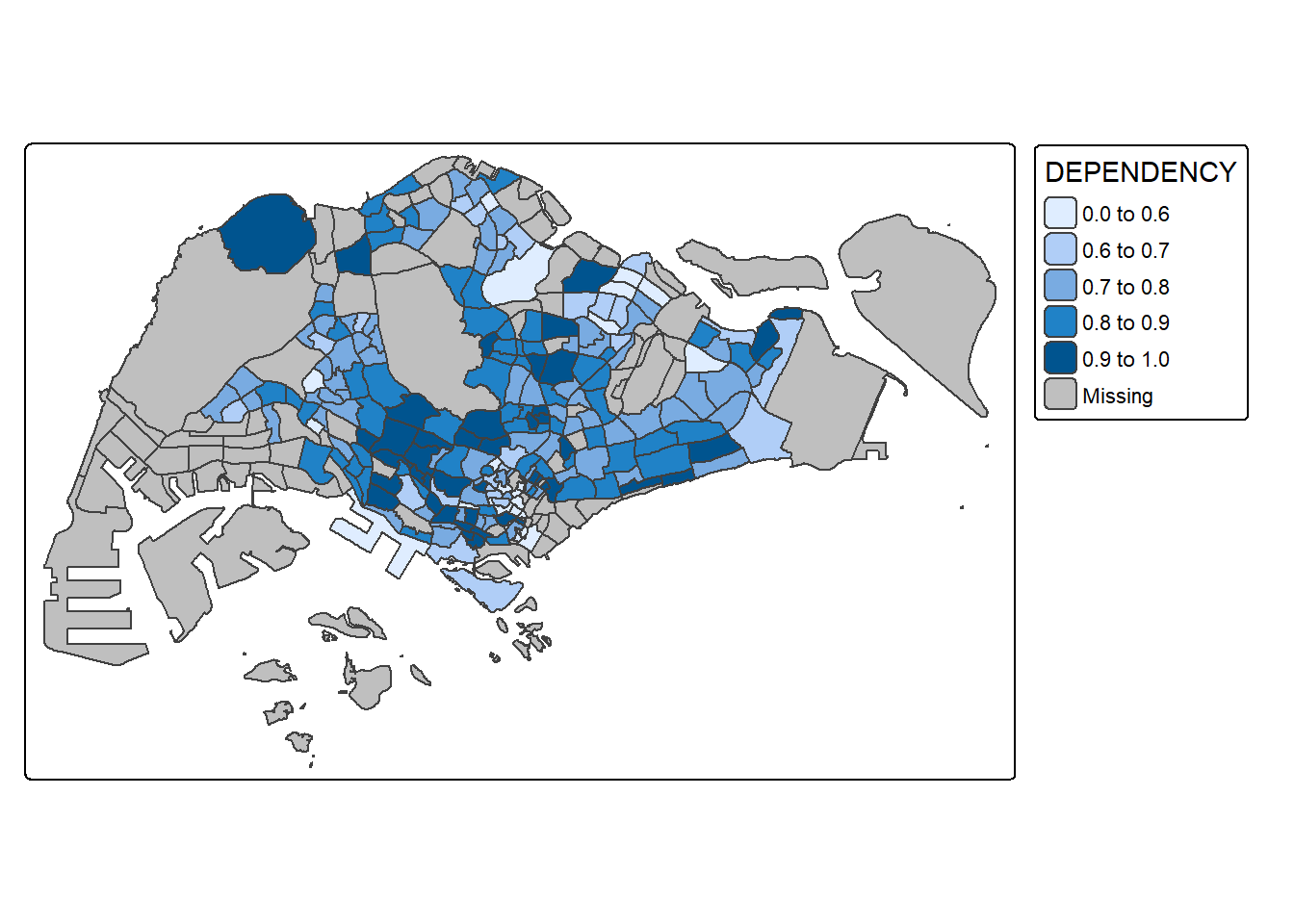
tmap supports colour ramps either defined by the user or a set of predefined colour ramps from the RColorBrewer package.
To change the colour, we assign the preferred colour to values argument of tm_scale_intervals() as shown in the code chunk below.
tm_shape(mpsz_pop2020)+
  tm_polygons("DEPENDENCY",
      fill.scale = tm_scale_intervals(
        style = "quantile",
        n = 5,
        values = "brewer.greens")) +
  tm_borders(fill_alpha = 0.5)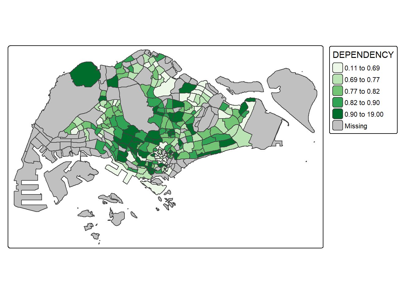
Notice that the choropleth map is shaded in green.
To reverse the colour shading, add a “-” prefix.
tm_shape(mpsz_pop2020)+
  tm_polygons("DEPENDENCY",
      fill.scale = tm_scale_intervals(
        style = "quantile",
        n = 5,
        values = "-brewer.greens")) +
  tm_borders(fill_alpha = 0.5)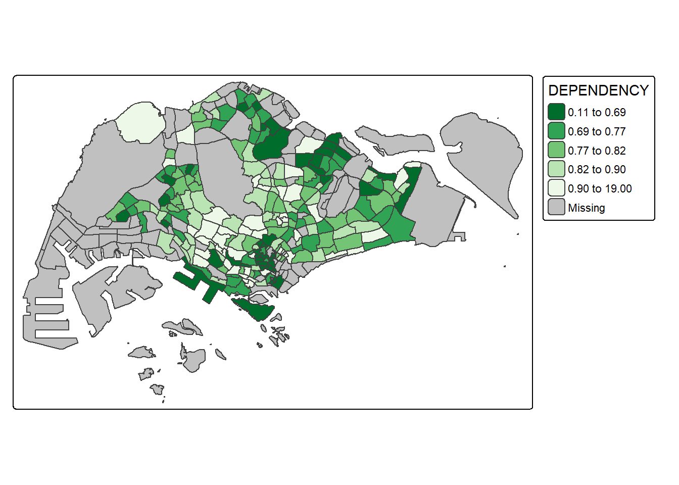
Notice that the colour scheme has been reversed.
Map layout refers to the combination of all map elements into a cohensive map. Map elements include among others the objects to be mapped, the title, the scale bar, the compass, margins and aspects ratios. Colour settings and data classification methods covered in the previous section relate to the palette and break-points are used to affect how the map looks.
In tmap, several tm_legend() options are provided to change the placement, format and appearance of the legend.
tm_shape(mpsz_pop2020)+
  tm_polygons("DEPENDENCY",
      fill.scale = tm_scale_intervals(
        style = "jenks",
        n = 5,
        values = "brewer.greens"),
      fill.legend = tm_legend(
        title = "Dependency ratio")) +
  tm_borders(fill_alpha = 0.5) +
  tm_title("Distribution of Dependency Ratio by planning subzone \n(Jenks classification)")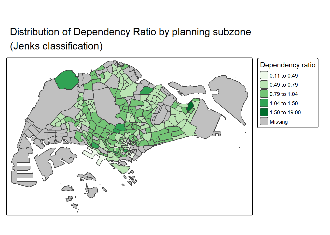
tmap allows a wide variety of layout settings to be changed. They can be called by using tmap_style().
The code chunk below shows the classic style is used.
tm_shape(mpsz_pop2020)+
  tm_fill("DEPENDENCY",
          style = "quantile",
          palette = "-Greens") +
  tm_borders(alpha = 0.5) +
  tmap_style("classic")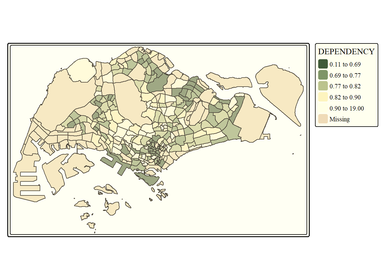
Beside map style, tmap also also provides arguments to draw other map furniture such as compass, scale bar and grid lines.
In the code chunk below, tm_compass(), tm_scale_bar() and tm_grid() are used to add compass, scale bar and grid lines onto the choropleth map.
tm_shape(mpsz_pop2020)+
  tm_polygons(fill = "DEPENDENCY",
              fill.scale = tm_scale_intervals(
                style = "quantile",
                n = 5,
                values = "brewer.blues"),
              fill.legend = tm_legend(
                title = "Dependency ratio")) +
  tm_title("Distribution of Dependency Ratio by planning subzone") +
  tm_layout(frame = TRUE) +
  tm_borders(fill_alpha = 0.5) +
  tm_compass(type="8star", size = 2) +
  tm_grid(alpha =0.2) +
  tm_credits("Source: Planning Sub-zone boundary from Urban Redevelopment Authorithy (URA)\n and Population data from Department of Statistics DOS",
             position = c("left", "bottom"))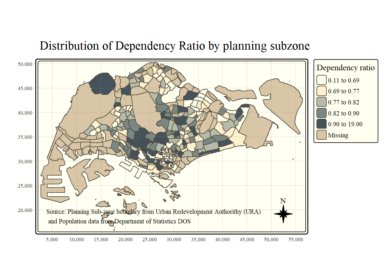
To reset the default style, refer to the code chunk below.
tmap_style("white")Small multiple maps, also referred to as facet maps, are composed of many maps arrange side-by-side, and sometimes stacked vertically. Small multiple maps enable the visualisation of how spatial relationships change with respect to another variable, such as time.
In tmap, small multiple maps can be plotted in three ways:
by assigning multiple values to at least one of the asthetic arguments,
by defining a group-by variable in tm_facets(), and
by creating multiple stand-alone maps with tmap_arrange().
In this example, small multiple choropleth maps are created by defining ncols in tm_fill()
tm_shape(mpsz_pop2020)+
  tm_fill(c("YOUNG", "AGED"),
          style = "equal",
          palette = "Blues") +
  tm_layout(legend.position = c("right", "bottom")) +
  tm_borders(alpha = 0.5) +
  tmap_style("white")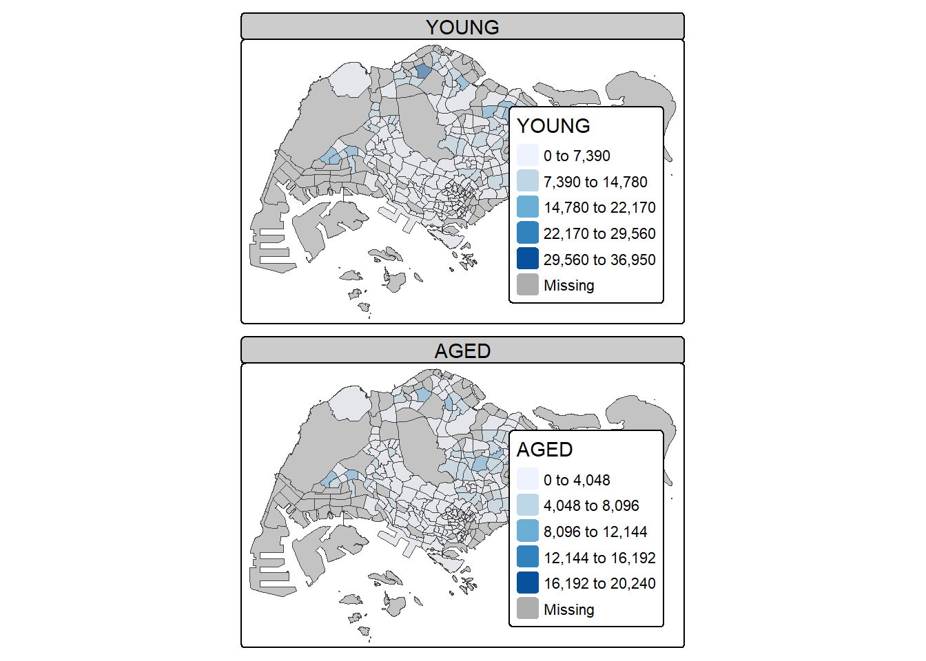
In this example, small multiple choropleth maps are created by assigning multiple values to at least one of the aesthetic arguments
tm_shape(mpsz_pop2020)+
  tm_polygons(c("DEPENDENCY","AGED"),
          style = c("equal", "quantile"),
          palette = list("Blues","Greens")) +
  tm_layout(legend.position = c("right", "bottom"))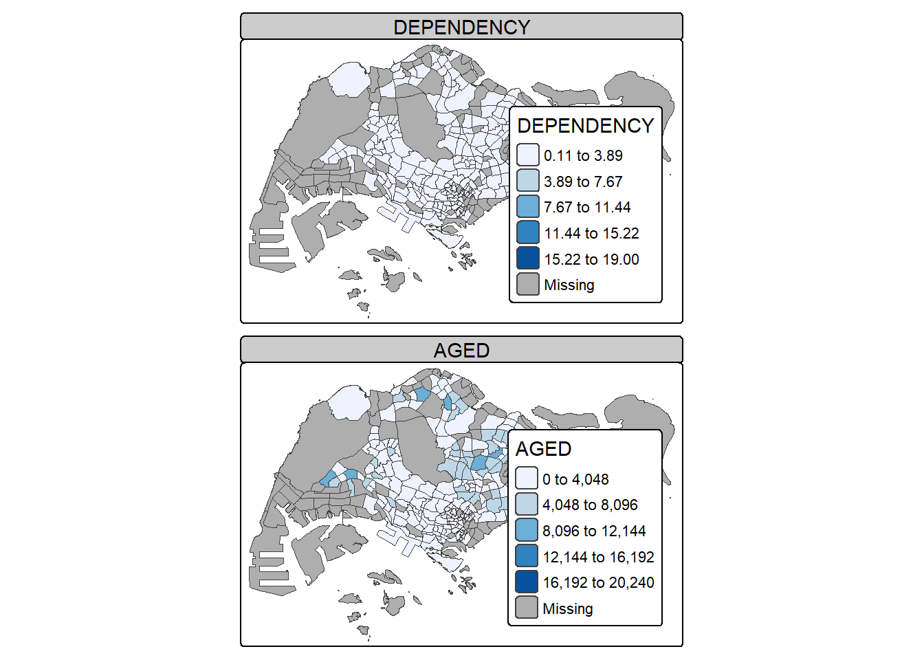
In this example, multiple small choropleth maps are created by using tm_facets().
tm_shape(mpsz_pop2020) +
  tm_fill("DEPENDENCY",
          style = "quantile",
          palette = "Blues",
          thres.poly = 0) +
  tm_facets(by="REGION_N",
            free.coords=TRUE) +
  tm_layout(legend.show = FALSE,
            title.position = c("center", "center"),
            title.size = 20) +
  tm_borders(alpha = 0.5)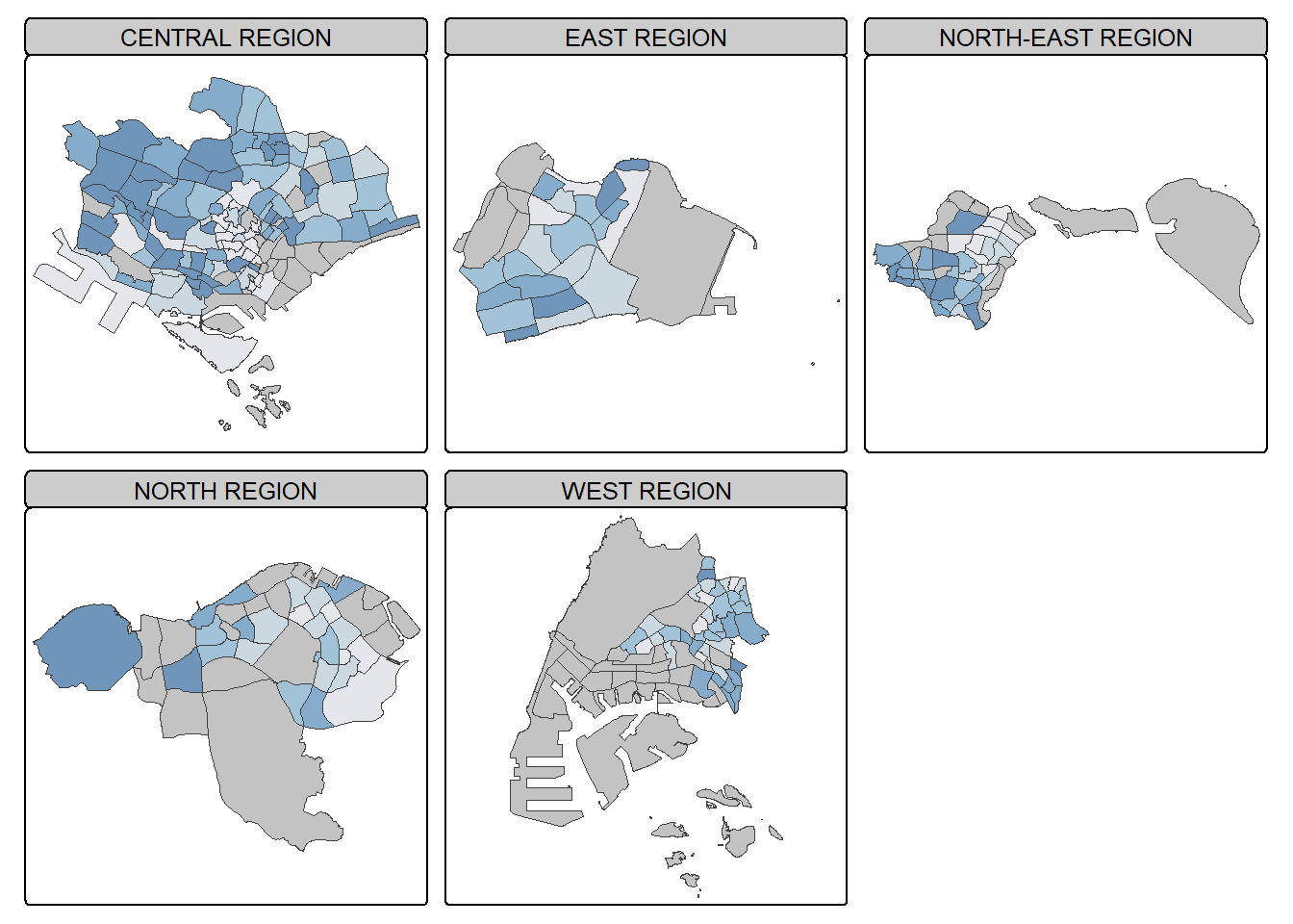
In this example, multiple small choropleth maps are created by creating multiple stand-alone maps with tmap_arrange().
youngmap <- tm_shape(mpsz_pop2020)+
  tm_polygons("YOUNG",
              style = "quantile",
              palette = "Blues")

agedmap <- tm_shape(mpsz_pop2020)+
  tm_polygons("AGED",
              style = "quantile",
              palette = "Blues")

tmap_arrange(youngmap, agedmap, asp=1, ncol=2)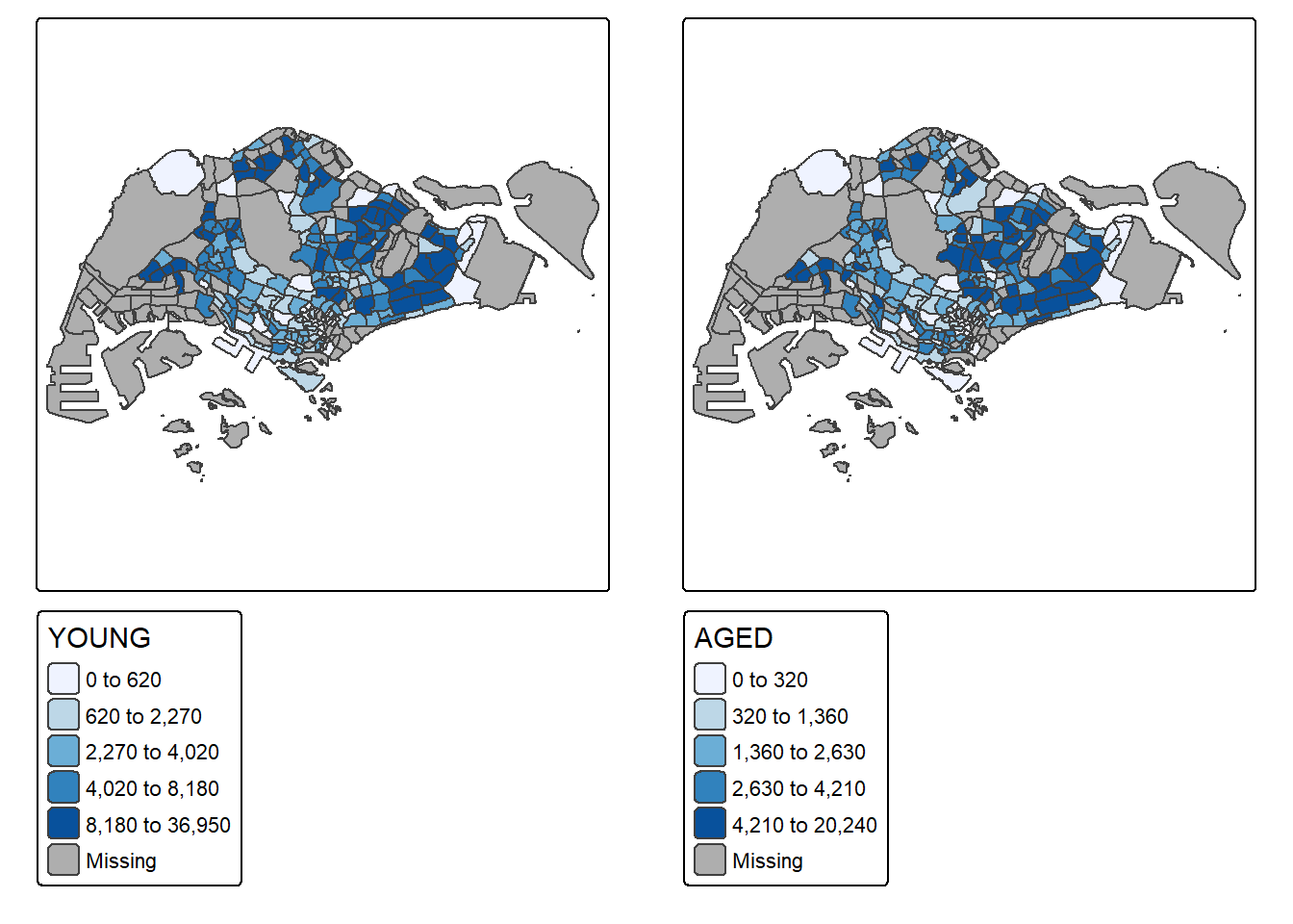
Instead of creating small multiple choropleth map, you can also use selection funtion to map spatial objects meeting the selection criterion.
tm_shape(mpsz_pop2020[mpsz_pop2020$REGION_N=="CENTRAL REGION", ])+
  tm_fill("DEPENDENCY",
          style = "quantile",
          palette = "Blues",
          legend.hist = TRUE,
          legend.is.portrait = TRUE,
          legend.hist.z = 0.1) +
  tm_layout(legend.outside = TRUE,
            legend.height = 0.45,
            legend.width = 5.0,
            legend.position = c("right", "bottom"),
            frame = FALSE) +
  tm_borders(alpha = 0.5)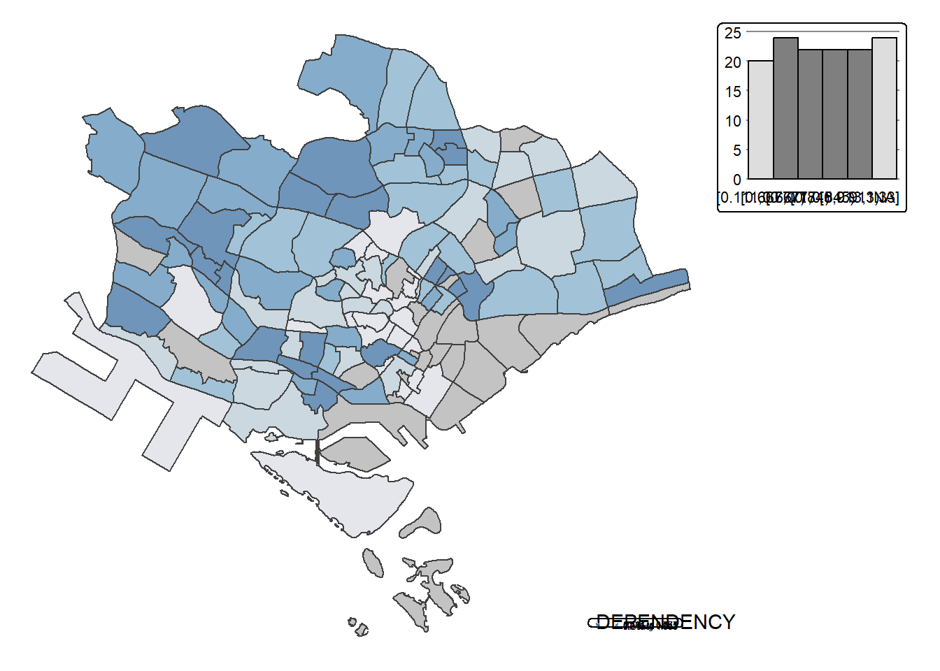
Proportional symbol maps (also known as graduate symbol maps) are a class of maps that use the visual variable of size to represent differences in the magnitude of a discrete, abruptly changing phenomenon, e.g. counts of people. Like choropleth maps, you can create classed or unclassed versions of these maps. The classed ones are known as range-graded or graduated symbols, and the unclassed are called proportional symbols, where the area of the symbols are proportional to the values of the attribute being mapped. In this hands-on exercise, you will learn how to create a proportional symbol map showing the number of wins by Singapore Pools’ outlets using an R package called tmap.
By the end of this hands-on exercise, you will acquire the following skills by using appropriate R packages:
To import an aspatial data file into R.
To convert it into simple point feature data frame and at the same time, to assign an appropriate projection reference to the newly create simple point feature data frame.
To plot interactive proportional symbol maps.
Before we get started, we need to ensure that tmap package of R and other related R packages have been installed and loaded into R.
pacman::p_load(sf, tmap, tidyverse)The data set use for this hands-on exercise is called SGPools_svy21. The data is in csv file format.
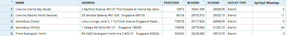
Figure below shows the first 15 records of SGPools_svy21.csv. It consists of seven columns. The XCOORD and YCOORD columns are the x-coordinates and y-coordinates of SingPools outlets and branches. They are in Singapore SVY21 Projected Coordinates System.
The code chunk below uses read_csv() function of readr package to import SGPools_svy21.csv into R as a tibble data frame called sgpools.
sgpools <- read_csv("data/aspatial/SGPools_svy21.csv")After importing the data file into R, it is important for us to examine if the data file has been imported correctly.
The code chunk below shows list() is used to do the job.
list(sgpools) [[1]]
# A tibble: 306 × 7
NAME ADDRESS POSTCODE XCOORD YCOORD `OUTLET TYPE` `Gp1Gp2 Winnings`
<chr> <chr> <dbl> <dbl> <dbl> <chr> <dbl>
1 Livewire (Mar… 2 Bayf… 18972 30842. 29599. Branch 5
2 Livewire (Res… 26 Sen… 98138 26704. 26526. Branch 11
3 SportsBuzz (K… Lotus … 738078 20118. 44888. Branch 0
4 SportsBuzz (P… 1 Sele… 188306 29777. 31382. Branch 44
5 Prime Serango… Blk 54… 552542 32239. 39519. Branch 0
6 Singapore Poo… 1A Woo… 731001 21012. 46987. Branch 3
7 Singapore Poo… Blk 64… 370064 33990. 34356. Branch 17
8 Singapore Poo… Blk 88… 370088 33847. 33976. Branch 16
9 Singapore Poo… Blk 30… 540308 33910. 41275. Branch 21
10 Singapore Poo… Blk 20… 560202 29246. 38943. Branch 25
# ℹ 296 more rowsNotice that the sgpools data in tibble data frame and not the common R data frame.
The code chunk below converts sgpools data frame into a simple feature data frame by using st_as_sf() of sf packages
sgpools_sf <- st_as_sf(sgpools,
                       coords = c("XCOORD", "YCOORD"),
                       crs= 3414)
Things to learn from the arguments above:
The coords argument requires you to provide the column name of the x-coordinates first then followed by the column name of the y-coordinates.
The crs argument required you to provide the coordinates system in epsg format. EPSG: 3414 is Singapore SVY21 Projected Coordinate System. You can search for other country’s epsg code by refering to epsg.io.
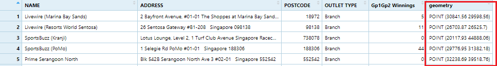
Figure below shows the data table of sgpools_sf. Notice that a new column called geometry has been added into the data frame.
You can display the basic information of the newly created sgpools_sf by using the code chunk below.
list(sgpools_sf)[[1]]
Simple feature collection with 306 features and 5 fields
Geometry type: POINT
Dimension: XY
Bounding box: xmin: 7844.194 ymin: 26525.7 xmax: 45176.57 ymax: 47987.13
Projected CRS: SVY21 / Singapore TM
# A tibble: 306 × 6
NAME ADDRESS POSTCODE `OUTLET TYPE` `Gp1Gp2 Winnings`
* <chr> <chr> <dbl> <chr> <dbl>
1 Livewire (Marina Bay Sands) 2 Bayf… 18972 Branch 5
2 Livewire (Resorts World Sen… 26 Sen… 98138 Branch 11
3 SportsBuzz (Kranji) Lotus … 738078 Branch 0
4 SportsBuzz (PoMo) 1 Sele… 188306 Branch 44
5 Prime Serangoon North Blk 54… 552542 Branch 0
6 Singapore Pools Woodlands C… 1A Woo… 731001 Branch 3
7 Singapore Pools 64 Circuit … Blk 64… 370064 Branch 17
8 Singapore Pools 88 Circuit … Blk 88… 370088 Branch 16
9 Singapore Pools Anchorvale … Blk 30… 540308 Branch 21
10 Singapore Pools Ang Mo Kio … Blk 20… 560202 Branch 25
# ℹ 296 more rows
# ℹ 1 more variable: geometry <POINT [m]>The output shows that sgppols_sf is in point feature class. It’s epsg ID is 3414. The bbox provides information of the extend of the geospatial data.
To create an interactive proportional symbol map in R, the view mode of tmap will be used.
The code churn below will turn on the interactive mode of tmap.
tmap_mode("view")The code chunks below are used to create an interactive point symbol map.
tm_shape(sgpools_sf) +
  tm_bubbles(fill = "red",
           size = 1,
           col = "black",
           lwd = 1)
To draw a proportional symbol map, we need to assign a numerical variable to the size visual attribute. The code chunks below show that the variable Gp1Gp2Winnings is assigned to size visual attribute.
tm_shape(sgpools_sf) +
  tm_bubbles(fill = "red",
             size = "Gp1Gp2 Winnings",
             col = "black",
             lwd = 1)
The proportional symbol map can be further improved by using the colour visual attribute. In the code chunks below, OUTLET_TYPE variable is used as the colour attribute variable.
tm_shape(sgpools_sf) +
  tm_bubbles(fill = "OUTLET TYPE",
             size = "Gp1Gp2 Winnings",
             col = "black",
             lwd = 1)
An impressive and little-know feature of tmap’s view mode is that it also works with faceted plots. The argument sync in tm_facets() can be used in this case to produce multiple maps with synchronised zoom and pan settings.
tm_shape(sgpools_sf) +
  tm_bubbles(fill = "OUTLET TYPE",
             size = "Gp1Gp2 Winnings",
             col = "black",
             lwd = 1) +
  tm_facets(by= "OUTLET TYPE",
            nrow = 1,
            sync = TRUE)
Before you end the session, it is wiser to switch tmap’s Viewer back to plot mode by using the code chunk below.
tmap_mode("plot")In this in-class exercise, you will gain hands-on experience on using appropriate R methods to plot analytical maps.
By the end of this in-class exercise, you will be able to use appropriate functions of tmap and tidyverse to perform the following tasks:
Importing geospatial data in rds format into R environment.
Creating cartographic quality choropleth maps by using appropriate tmap functions.
Creating rate map
Creating percentile map
Creating boxmap
pacman::p_load(tmap, tidyverse, sf)For the purpose of this hands-on exercise, a prepared data set called NGA_wp.rds will be used. The data set is a polygon feature data.frame providing information on water point of Nigeria at the LGA level. You can find the data set in the rds sub-direct of the hands-on data folder.
NGA_wp <- read_rds("data/rds/NGA_wp.rds")p1 <- tm_shape(NGA_wp) +
tm_polygons(fill = "wp_functional",
fill.scale = tm_scale_intervals(
style = "equal",
n = 10,
values = "brewer.blues"),
fill.legend = tm_legend(
position = c("right", "bottom"))) +
tm_borders(lwd = 0.1,
fill_alpha = 1) +
tm_title("Distribution of functional water point by LGAs")p2 <- tm_shape(NGA_wp) +
tm_polygons(fill = "total_wp",
fill.scale = tm_scale_intervals(
style = "equal",
n = 10,
values = "brewer.blues"),
fill.legend = tm_legend(
position = c("right", "bottom"))) +
tm_borders(lwd = 0.1,
fill_alpha = 1) +
tm_title("Distribution of total water point by LGAs")tmap_arrange(p2, p1, nrow = 1)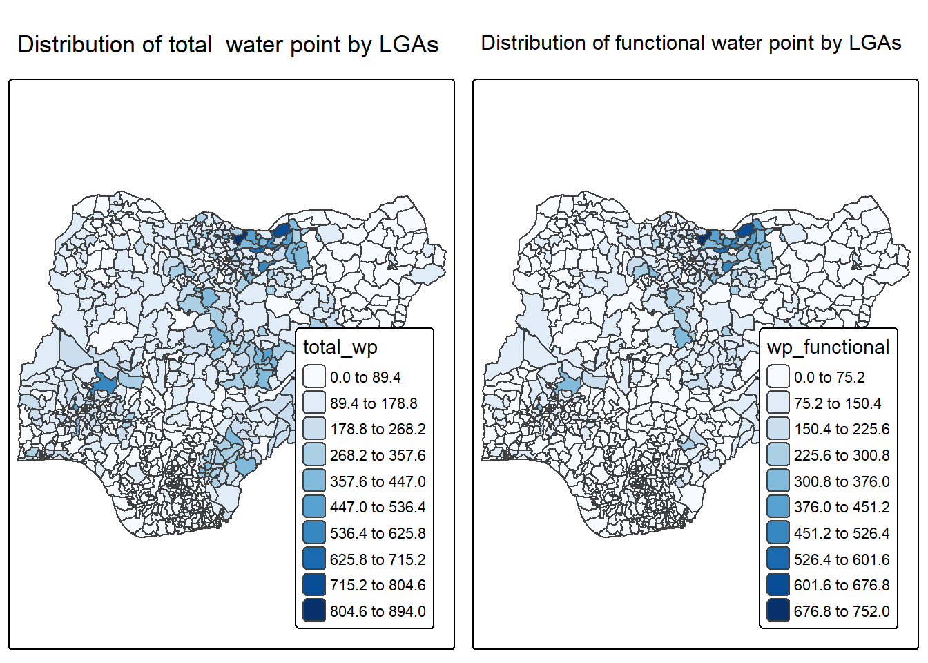
In much of our readings we have now seen the importance to map rates rather than counts of things, and that is for the simple reason that water points are not equally distributed in space. That means that if we do not account for how many water points are somewhere, we end up mapping total water point size rather than our topic of interest.
We will tabulate the proportion of functional water points and the proportion of non-functional water points in each LGA. In the following code chunk, mutate() from dplyr package is used to derive two fields, namely pct_functional and pct_nonfunctional.
NGA_wp <- NGA_wp %>%
  mutate(pct_functional = wp_functional/total_wp) %>%
mutate(pct_nonfunctional = wp_nonfunctional/total_wp)tm_shape(NGA_wp) +
tm_polygons("pct_functional",
fill.scale = tm_scale_intervals(
style = "equal",
n = 10,
values = "brewer.blues"),
fill.legend = tm_legend(
position = c("right", "bottom"))) +
tm_borders(lwd = 0.1,
fill_alpha = 1) +
tm_title("Rate map of functional water point by LGAs")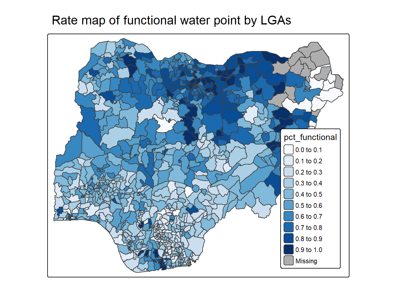
Extreme value maps are variations of common choropleth maps where the classification is designed to highlight extreme values at the lower and upper end of the scale, with the goal of identifying outliers. These maps were developed in the spirit of spatializing EDA, i.e., adding spatial features to commonly used approaches in non-spatial EDA (Anselin 1994).
The percentile map is a special type of quantile map with six specific categories: 0-1%,1-10%, 10-50%,50-90%,90-99%, and 99-100%. The corresponding breakpoints can be derived by means of the base R quantile command, passing an explicit vector of cumulative probabilities as c(0,.01,.1,.5,.9,.99,1). Note that the begin and endpoint need to be included.
Step 1: Exclude records with NA by using the code chunk below.
NGA_wp <- NGA_wp %>%
  drop_na()
Step 2: Creating customised classification and extracting values
percent <- c(0,.01,.1,.5,.9,.99,1)
var <- NGA_wp["pct_functional"] %>%
  st_set_geometry(NULL)
quantile(var[,1], percent)
0% 1% 10% 50% 90% 99% 100%
0.0000000 0.0000000 0.2169811 0.4791667 0.8611111 1.0000000 1.0000000 Writing a function has three big advantages over using copy-and-paste:
You can give a function an evocative name that makes your code easier to understand.
As requirements change, you only need to update code in one place, instead of many.
You eliminate the chance of making incidental mistakes when you copy and paste (i.e. updating a variable name in one place, but not in another).
Source: Chapter 19: Functions of R for Data Science.
Firstly, we will write an R function as shown below to extract a variable (i.e. wp_nonfunctional) as a vector out of an sf data.frame.
- arguments:
vname: variable name (as character, in quotes)
df: name of sf data frame
- returns:
- v: vector with values (without a column name)
get.var <- function(vname,df) {
  v <- df[vname] %>%
    st_set_geometry(NULL)
  v <- unname(v[,1])
  return(v)
}
Next, we will write a percentile mapping function by using the code chunk below.
percentmap <- function(vnam, df, legtitle=NA, mtitle="Percentile Map"){
  percent <- c(0,.01,.1,.5,.9,.99,1)
  var <- get.var(vnam, df)
  bperc <- quantile(var, percent)
  tm_shape(df) +
  tm_polygons() +
  tm_shape(df) +
     tm_polygons(vnam,
             title=legtitle,
             breaks=bperc,
             palette="Blues",
          labels=c("< 1%", "1% - 10%", "10% - 50%", "50% - 90%", "90% - 99%", "> 99%"))  +
  tm_borders() +
  tm_layout(main.title = mtitle,
            title.position = c("right","bottom"))
}
To run the function, type the code chunk as shown below.
percentmap("total_wp", NGA_wp)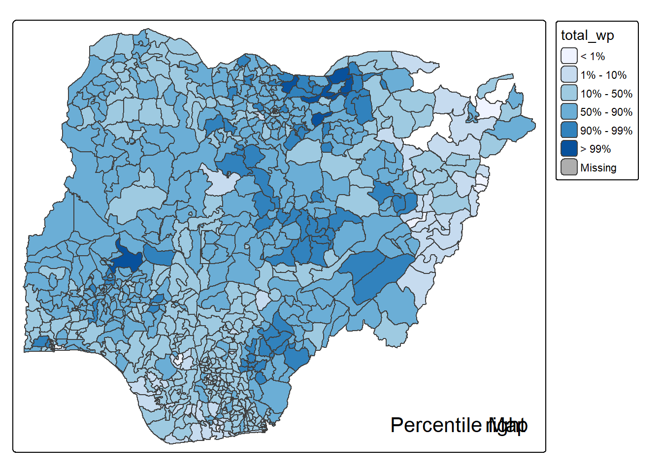
Note that this is just a bare bones implementation. Additional arguments such as the title, legend positioning just to name a few of them, could be passed to customise various features of the map.
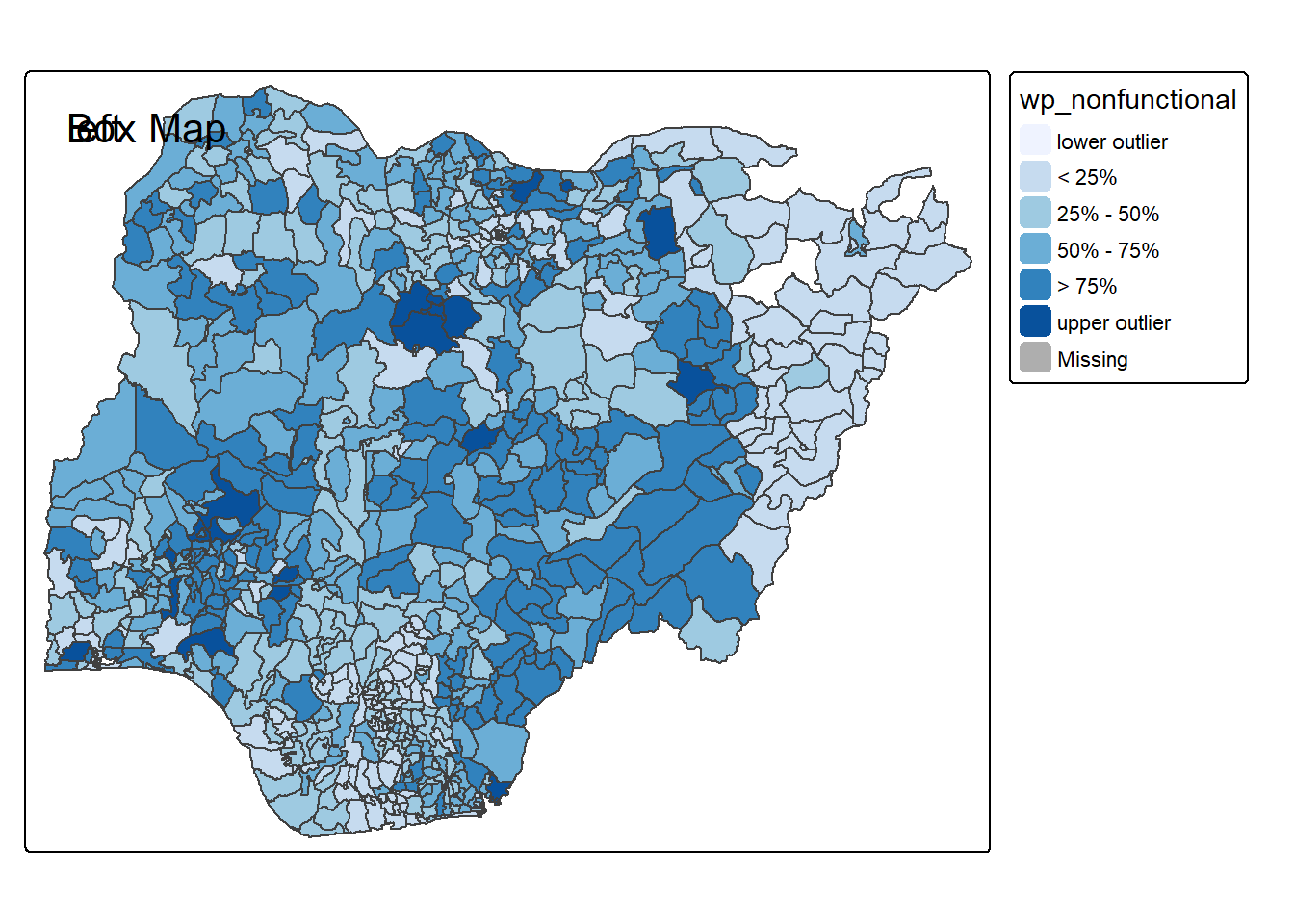
In essence, a box map is an augmented quartile map, with an additional lower and upper category. When there are lower outliers, then the starting point for the breaks is the minimum value, and the second break is the lower fence. In contrast, when there are no lower outliers, then the starting point for the breaks will be the lower fence, and the second break is the minimum value (there will be no observations that fall in the interval between the lower fence and the minimum value).
ggplot(data = NGA_wp,
       aes(x = "",
           y = wp_nonfunctional)) +
  geom_boxplot()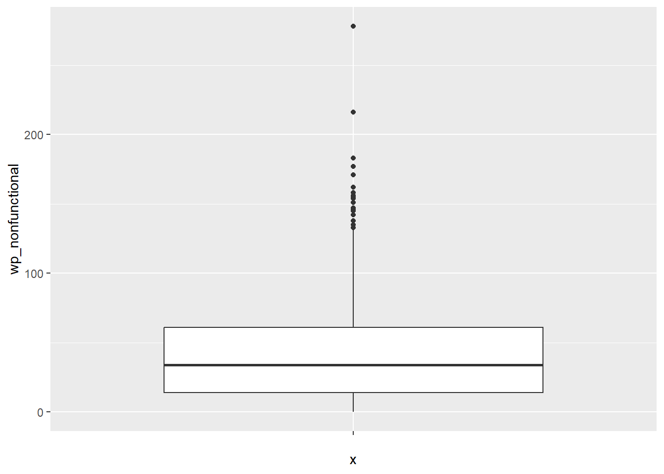
Displaying summary statistics on a choropleth map by using the basic principles of boxplot.
To create a box map, a custom breaks specification will be used. However, there is a complication. The break points for the box map vary depending on whether lower or upper outliers are present.
The code chunk below is an R function that creating break points for a box map.
- arguments:
v: vector with observations
mult: multiplier for IQR (default 1.5)
- returns:
- bb: vector with 7 break points compute quartile and fences
boxbreaks <- function(v,mult=1.5) {
  qv <- unname(quantile(v))
  iqr <- qv[4] - qv[2]
  upfence <- qv[4] + mult * iqr
  lofence <- qv[2] - mult * iqr
  # initialize break points vector
  bb <- vector(mode="numeric",length=7)
  # logic for lower and upper fences
  if (lofence < qv[1]) {  # no lower outliers
    bb[1] <- lofence
    bb[2] <- floor(qv[1])
  } else {
    bb[2] <- lofence
    bb[1] <- qv[1]
  }
  if (upfence > qv[5]) { # no upper outliers
    bb[7] <- upfence
    bb[6] <- ceiling(qv[5])
  } else {
    bb[6] <- upfence
    bb[7] <- qv[5]
  }
  bb[3:5] <- qv[2:4]
  return(bb)
}
The code chunk below is an R function to extract a variable as a vector out of an sf data frame.
- arguments:
vname: variable name (as character, in quotes)
df: name of sf data frame
- returns:
- v: vector with values (without a column name)
get.var <- function(vname,df) {
  v <- df[vname] %>% st_set_geometry(NULL)
  v <- unname(v[,1])
  return(v)
}
Let’s test the newly created function
var <- get.var("wp_nonfunctional", NGA_wp)
boxbreaks(var)
[1] -56.5 0.0 14.0 34.0 61.0 131.5 278.0The code chunk below is an R function to create a box map. - arguments: - vnam: variable name (as character, in quotes) - df: simple features polygon layer - legtitle: legend title - mtitle: map title - mult: multiplier for IQR - returns: - a tmap-element (plots a map)
boxmap <- function(vnam, df,
                   legtitle=NA,
                   mtitle="Box Map",
                   mult=1.5){
  var <- get.var(vnam,df)
  bb <- boxbreaks(var)
  tm_shape(df) +
    tm_polygons() +
  tm_shape(df) +
     tm_fill(vnam,title=legtitle,
             breaks=bb,
             palette="Blues",
          labels = c("lower outlier",
                     "< 25%",
                     "25% - 50%",
                     "50% - 75%",
                     "> 75%",
                     "upper outlier"))  +
  tm_borders() +
  tm_layout(main.title = mtitle,
            title.position = c("left",
                               "top"))
}tmap_mode("plot")
boxmap("wp_nonfunctional", NGA_wp)