Funnel plot is a specially designed data visualisation for conducting unbiased comparison between outlets, stores or business entities. By the end of this hands-on exercise, you will gain hands-on experience on:
- plotting funnel plots by using funnelPlotR package,
- plotting static funnel plot by using ggplot2 package, and
- plotting interactive funnel plot by using both plotly R and ggplot2 packages.
In this exercise, four R packages will be used. They are:
- readr for importing csv into R.
- FunnelPlotR for creating funnel plot.
- ggplot2 for creating funnel plot manually.
- knitr for building static html table.
- plotly for creating interactive funnel plot.
pacman::p_load(tidyverse, FunnelPlotR, plotly, knitr)In this section, COVID-19_DKI_Jakarta will be used. The data was downloaded from Open Data Covid-19 Provinsi DKI Jakarta portal. For this hands-on exercise, we are going to compare the cumulative COVID-19 cases and death by sub-district (i.e. kelurahan) as at 31st July 2021, DKI Jakarta.
The code chunk below imports the data into R and save it into a tibble data frame object called covid19.
covid19 <- read_csv("data/COVID-19_DKI_Jakarta.csv") %>%
mutate_if(is.character, as.factor)head(covid19)# A tibble: 6 × 7
`Sub-district ID` City District `Sub-district` Positive Recovered Death
<dbl> <fct> <fct> <fct> <dbl> <dbl> <dbl>
1 3172051003 JAKARTA UT… PADEMAN… ANCOL 1776 1691 26
2 3173041007 JAKARTA BA… TAMBORA ANGKE 1783 1720 29
3 3175041005 JAKARTA TI… KRAMAT … BALE KAMBANG 2049 1964 31
4 3175031003 JAKARTA TI… JATINEG… BALI MESTER 827 797 13
5 3175101006 JAKARTA TI… CIPAYUNG BAMBU APUS 2866 2792 27
6 3174031002 JAKARTA SE… MAMPANG… BANGKA 1828 1757 26FunnelPlotR package uses ggplot to generate funnel plots. It requires a numerator (events of interest), denominator (population to be considered) and group. The key arguments selected for customisation are:
limit: plot limits (95 or 99).label_outliers: to label outliers (true or false).Poisson_limits: to add Poisson limits to the plot.OD_adjust: to add overdispersed limits to the plot.xrangeandyrange: to specify the range to display for axes, acts like a zoom function.- Other aesthetic components such as graph title, axis labels etc.
The code chunk below plots a funnel plot.
funnel_plot(
  .data = covid19,
  numerator = Positive,
  denominator = Death,
  group = `Sub-district`
)
A funnel plot object with 267 points of which 0 are outliers.
Plot is adjusted for overdispersion.
Things to learn from the code chunk above.
groupin this function is different from the scatterplot. Here, it defines the level of the points to be plotted i.e. Sub-district, District or City. If Cityc is chosen, there are only six data points.- By default,
data_typeargument is “SR”. limit: Plot limits, accepted values are: 95 or 99, corresponding to 95% or 99.8% quantiles of the distribution.
The code chunk below plots a funnel plot.
funnel_plot(
  .data = covid19,
  numerator = Death,
  denominator = Positive,
  group = `Sub-district`,
  data_type = "PR",     #<<
  xrange = c(0, 6500),  #<<
  yrange = c(0, 0.05)   #<<
)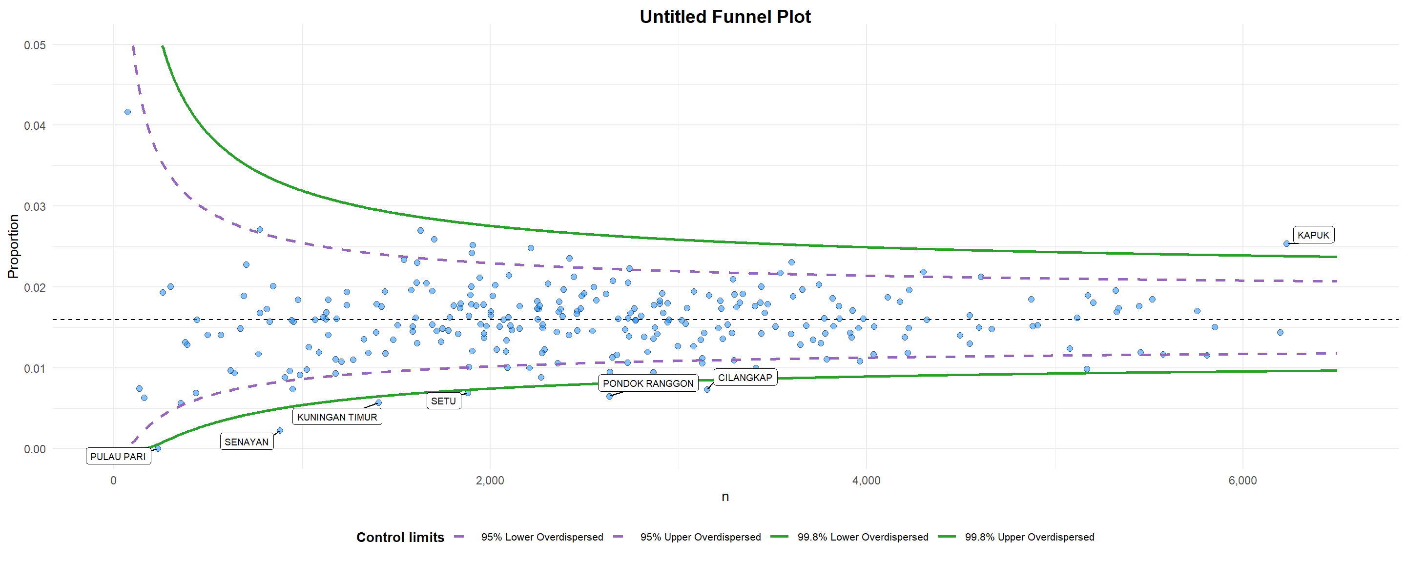
A funnel plot object with 267 points of which 7 are outliers.
Plot is adjusted for overdispersion.
Things to learn from the code chunk above. + data_type argument is used to change from default “SR” to “PR” (i.e. proportions). + xrange and yrange are used to set the range of x-axis and y-axis
The code chunk below plots a funnel plot.
funnel_plot(
  .data = covid19,
  numerator = Death,
  denominator = Positive,
  group = `Sub-district`,
  data_type = "PR",
  xrange = c(0, 6500),
  yrange = c(0, 0.05),
  label = NA,
  title = "Cumulative COVID-19 Fatality Rate by Cumulative Total Number of COVID-19 Positive Cases", #<<
  x_label = "Cumulative COVID-19 Positive Cases", #<<
  y_label = "Cumulative Fatality Rate"  #<<
)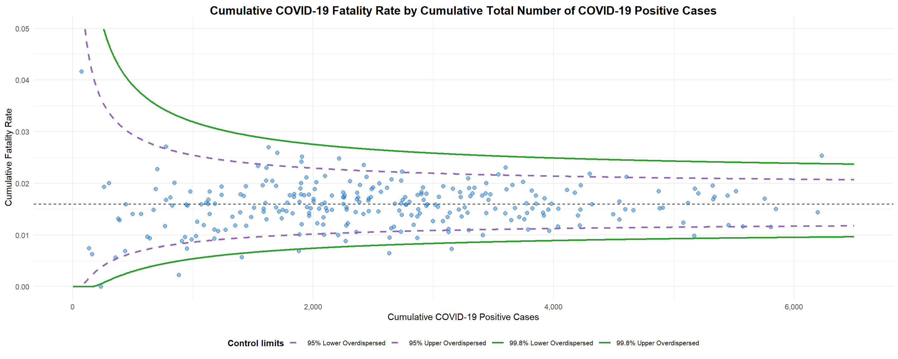
A funnel plot object with 267 points of which 7 are outliers.
Plot is adjusted for overdispersion.
Things to learn from the code chunk above.
label = NAargument is to removed the default label outliers feature.titleargument is used to add plot title.x_labelandy_labelarguments are used to add/edit x-axis and y-axis titles.
In this section, you will gain hands-on experience on building funnel plots step-by-step by using ggplot2. It aims to enhance you working experience of ggplot2 to customise speciallised data visualisation like funnel plot.
To plot the funnel plot from scratch, we need to derive cumulative death rate and standard error of cumulative death rate.
df <- covid19 %>%
  mutate(rate = Death / Positive) %>%
  mutate(rate.se = sqrt((rate*(1-rate)) / (Positive))) %>%
  filter(rate > 0)
Next, the fit.mean is computed by using the code chunk below.
fit.mean <- weighted.mean(df$rate, 1/df$rate.se^2)The code chunk below is used to compute the lower and upper limits for 95% confidence interval.
number.seq <- seq(1, max(df$Positive), 1)
number.ll95 <- fit.mean - 1.96 * sqrt((fit.mean*(1-fit.mean)) / (number.seq))
number.ul95 <- fit.mean + 1.96 * sqrt((fit.mean*(1-fit.mean)) / (number.seq))
number.ll999 <- fit.mean - 3.29 * sqrt((fit.mean*(1-fit.mean)) / (number.seq))
number.ul999 <- fit.mean + 3.29 * sqrt((fit.mean*(1-fit.mean)) / (number.seq))
dfCI <- data.frame(number.ll95, number.ul95, number.ll999,
                   number.ul999, number.seq, fit.mean)
In the code chunk below, ggplot2 functions are used to plot a static funnel plot.
p <- ggplot(df, aes(x = Positive, y = rate)) +
  geom_point(aes(label=`Sub-district`),
             alpha=0.4) +
  geom_line(data = dfCI,
            aes(x = number.seq,
                y = number.ll95),
            size = 0.4,
            colour = "grey40",
            linetype = "dashed") +
  geom_line(data = dfCI,
            aes(x = number.seq,
                y = number.ul95),
            size = 0.4,
            colour = "grey40",
            linetype = "dashed") +
  geom_line(data = dfCI,
            aes(x = number.seq,
                y = number.ll999),
            size = 0.4,
            colour = "grey40") +
  geom_line(data = dfCI,
            aes(x = number.seq,
                y = number.ul999),
            size = 0.4,
            colour = "grey40") +
  geom_hline(data = dfCI,
             aes(yintercept = fit.mean),
             size = 0.4,
             colour = "grey40") +
  coord_cartesian(ylim=c(0,0.05)) +
  annotate("text", x = 1, y = -0.13, label = "95%", size = 3, colour = "grey40") +
  annotate("text", x = 4.5, y = -0.18, label = "99%", size = 3, colour = "grey40") +
  ggtitle("Cumulative Fatality Rate by Cumulative Number of COVID-19 Cases") +
  xlab("Cumulative Number of COVID-19 Cases") +
  ylab("Cumulative Fatality Rate") +
  theme_light() +
  theme(plot.title = element_text(size=12),
        legend.position = c(0.91,0.85),
        legend.title = element_text(size=7),
        legend.text = element_text(size=7),
        legend.background = element_rect(colour = "grey60", linetype = "dotted"),
        legend.key.height = unit(0.3, "cm"))
p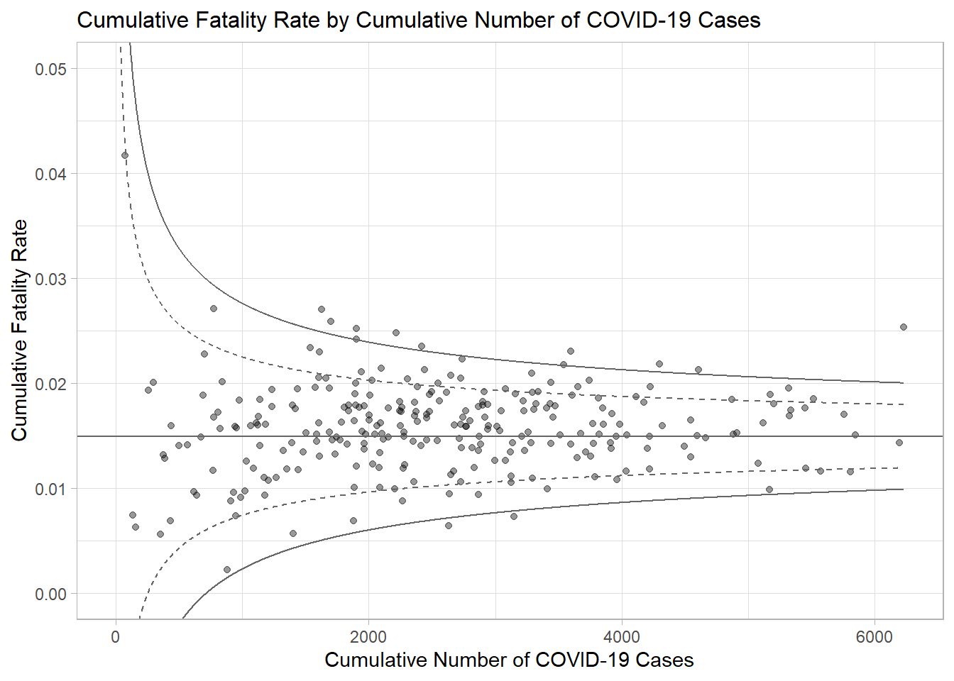
The funnel plot created using ggplot2 functions can be made interactive with ggplotly() of plotly r package.
fp_ggplotly <- ggplotly(p,
  tooltip = c("label",
              "x",
              "y"))
fp_ggplotlyVisualising distribution is not new in statistical analysis. In chapter 1 we have shared with you some of the popular statistical graphics methods for visualising distribution are histogram, probability density curve (pdf), boxplot, notch plot and violin plot and how they can be created by using ggplot2. In this chapter, we are going to share with you two relatively new statistical graphic methods for visualising distribution, namely ridgeline plot and raincloud plot by using ggplot2 and its extensions.
For the purpose of this exercise, the following R packages will be used, they are:
ggridges, a ggplot2 extension specially designed for plotting ridgeline plots,
ggdist, a ggplot2 extension spacially desgin for visualising distribution and uncertainty,
tidyverse, a family of R packages to meet the modern data science and visual communication needs,
ggthemes, a ggplot extension that provides the user additional themes, scales, and geoms for the ggplots package, and
colorspace, an R package provides a broad toolbox for selecting individual colors or color palettes, manipulating these colors, and employing them in various kinds of visualisations.
The code chunk below will be used load these R packages into RStudio environment.
pacman::p_load(ggdist, ggridges, ggthemes,
               colorspace, tidyverse, ggplot2)
For the purpose of this exercise, Exam_data.csv will be used.
In the code chunk below, read_csv() of readr package is used to import Exam_data.csv into R and saved it into a tibble data.frame.
exam <- read_csv("data/Exam_data.csv")Ridgeline plot (sometimes called Joyplot) is a data visualisation technique for revealing the distribution of a numeric value for several groups. Distribution can be represented using histograms or density plots, all aligned to the same horizontal scale and presented with a slight overlap.
Figure below is a ridgelines plot showing the distribution of English score by class.
ggplot(exam, aes(x = ENGLISH, y = CLASS)) +
  geom_density_ridges(fill = "gray", color = "black", scale = 1.5) +
  theme_minimal() +
  labs(x = "ENGLISH", y = "CLASS")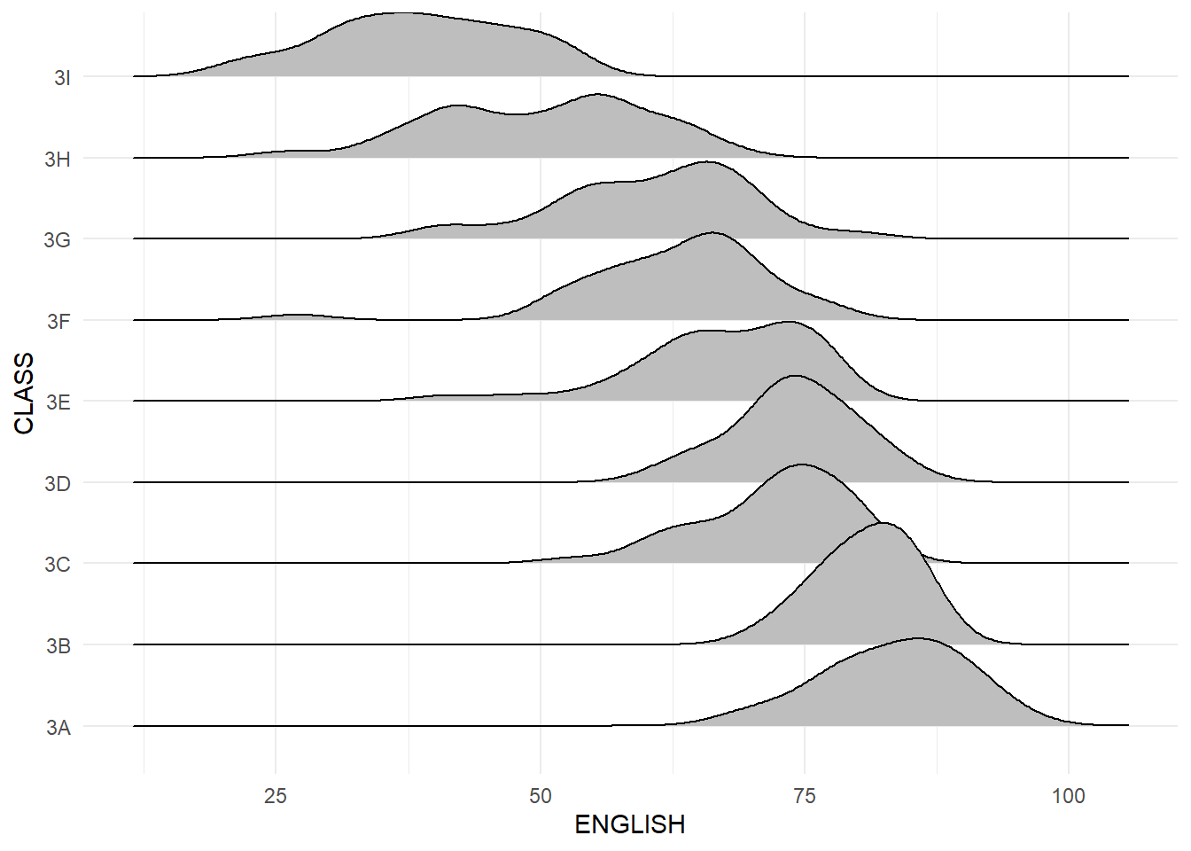
Ridgeline plots make sense when the number of group to represent is medium to high, and thus a classic window separation would take to much space. Indeed, the fact that groups overlap each other allows to use space more efficiently. If you have less than 5 groups, dealing with other distribution plots is probably better.
It works well when there is a clear pattern in the result, like if there is an obvious ranking in groups. Otherwise group will tend to overlap each other, leading to a messy plot not providing any insight.
There are several ways to plot ridgeline plot with R. In this section, you will learn how to plot ridgeline plot by using ggridges package.
ggridges package provides two main geom to plot gridgeline plots, they are: geom_ridgeline() and geom_density_ridges(). The former takes height values directly to draw the ridgelines, and the latter first estimates data densities and then draws those using ridgelines.
The ridgeline plot below is plotted by using geom_density_ridges().
ggplot(exam,
       aes(x = ENGLISH,
           y = CLASS)) +
  geom_density_ridges(
    scale = 3,
    rel_min_height = 0.01,
    bandwidth = 3.4,
    fill = lighten("#7097BB", .3),
    color = "white"
  ) +
  scale_x_continuous(
    name = "English grades",
    expand = c(0, 0)
    ) +
  scale_y_discrete(name = NULL, expand = expansion(add = c(0.2, 2.6))) +
  theme_ridges()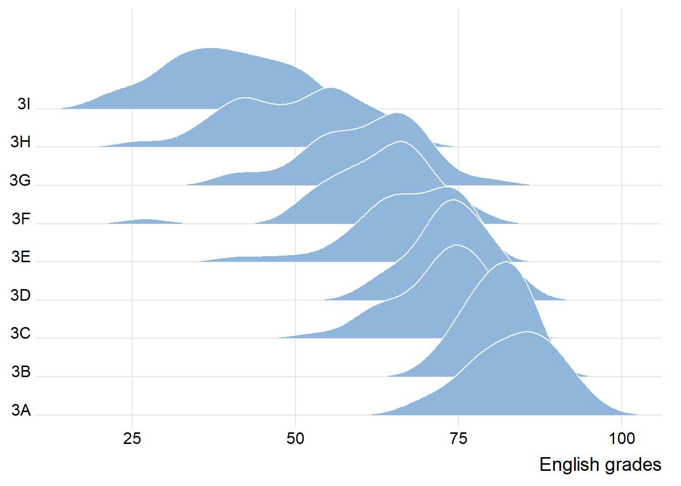
Sometimes we would like to have the area under a ridgeline not filled with a single solid color but rather with colors that vary in some form along the x axis. This effect can be achieved by using either geom_ridgeline_gradient() or geom_density_ridges_gradient(). Both geoms work just like geom_ridgeline() and geom_density_ridges(), except that they allow for varying fill colors. However, they do not allow for alpha transparency in the fill. For technical reasons, we can have changing fill colors or transparency but not both.
ggplot(exam,
       aes(x = ENGLISH,
           y = CLASS,
           fill = stat(x))) +
  geom_density_ridges_gradient(
    scale = 3,
    rel_min_height = 0.01) +
  scale_fill_viridis_c(name = "Temp. [F]",
                       option = "C") +
  scale_x_continuous(
    name = "English grades",
    expand = c(0, 0)
  ) +
  scale_y_discrete(name = NULL, expand = expansion(add = c(0.2, 2.6))) +
  theme_ridges()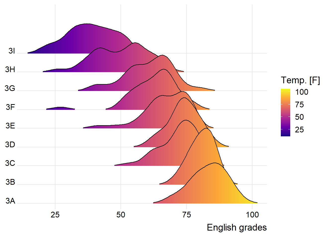
Beside providing additional geom objects to support the need to plot ridgeline plot, ggridges package also provides a stat function called stat_density_ridges() that replaces stat_density() of ggplot2.
Figure below is plotted by mapping the probabilities calculated by using stat(ecdf) which represent the empirical cumulative density function for the distribution of English score.
ggplot(exam,
       aes(x = ENGLISH,
           y = CLASS,
           fill = 0.5 - abs(0.5-stat(ecdf)))) +
  stat_density_ridges(geom = "density_ridges_gradient",
                      calc_ecdf = TRUE) +
  scale_fill_viridis_c(name = "Tail probability",
                       direction = -1) +
  theme_ridges()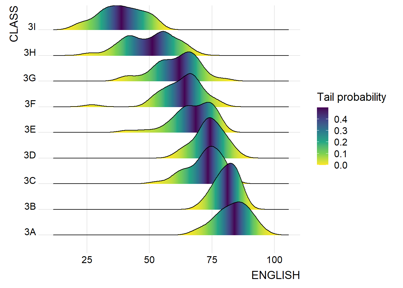
Including calc_ecdf = TRUE in stat_density_ridges() is important when you’re working with discrete or binned data or when your dataset is small or skewed, because it ensures that the density estimate respects the actual distribution of your data by basing it on the empirical cumulative distribution function (ECDF).
- Preserves data distribution accuracy:
By default,
stat_density_ridges()uses kernel density estimation (KDE), which smooths the distribution.If your data is not continuous or has spikes or gaps, KDE might misrepresent it.
calc_ecdf = TRUEuses ECDF to better capture irregularities in real data (especially in test scores like English grades that often cluster at certain values).
- Reduces risk of artificial modes or tails: - KDE may create modes (peaks) that don’t exist in your raw data.
- ECDF-based density avoids this by anchoring the density more directly to actual data points.- Improves reliability for smaller samples:
-    In small datasets, KDE often over-smooths.

-    ECDF helps retain the **discrete nature** and **true spread** of limited data.
By using geom_density_ridges_gradient(), we can colour the ridgeline plot by quantile, via the calculated stat(quantile) aesthetic as shown in the figure below.
ggplot(exam,
       aes(x = ENGLISH,
           y = CLASS,
           fill = factor(stat(quantile))
           )) +
  stat_density_ridges(
    geom = "density_ridges_gradient",
    calc_ecdf = TRUE,
    quantiles = 4,
    quantile_lines = TRUE) +
  scale_fill_viridis_d(name = "Quartiles") +
  theme_ridges()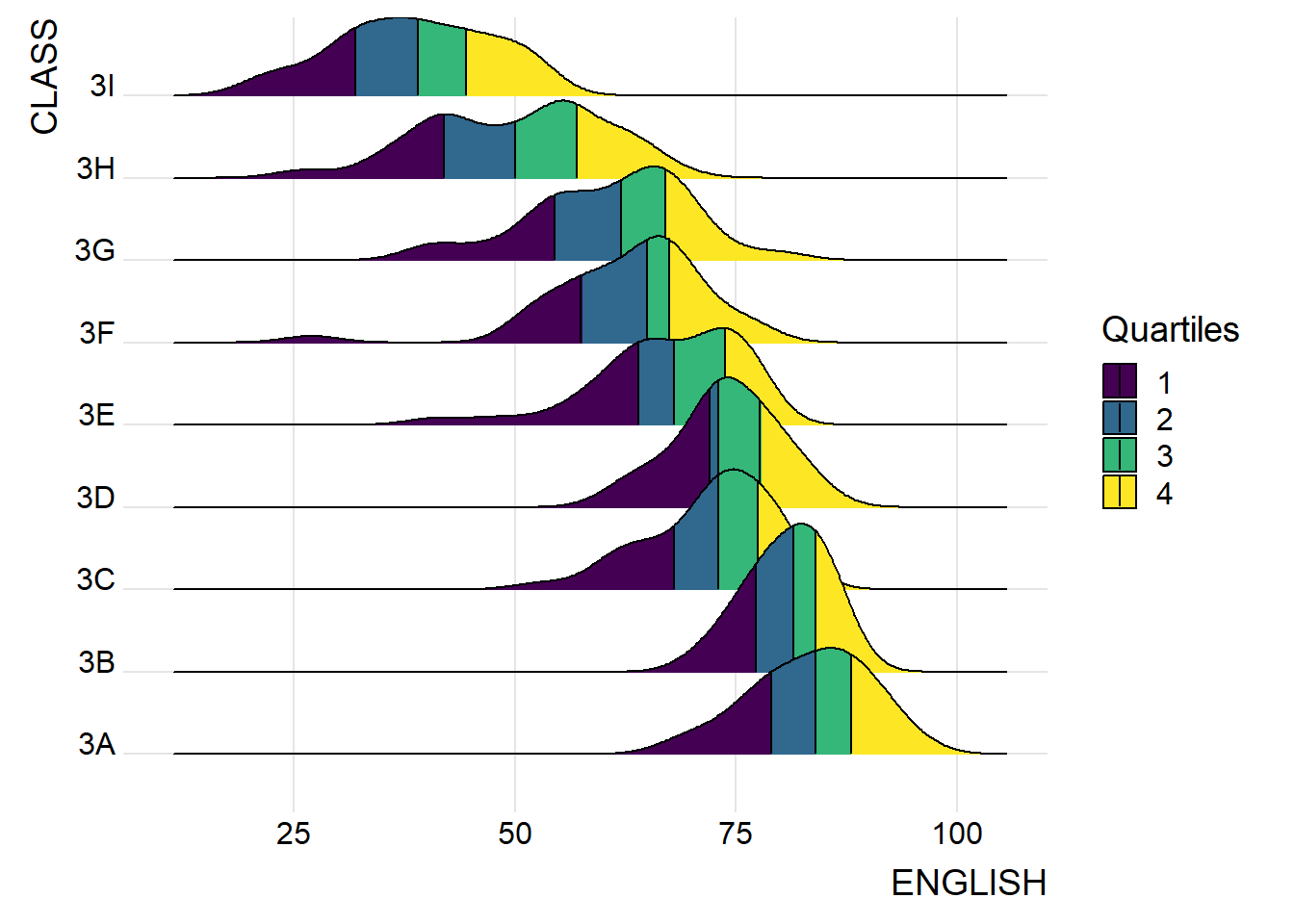
Instead of using number to define the quantiles, we can also specify quantiles by cut points such as 2.5% and 97.5% tails to colour the ridgeline plot as shown in the figure below.
ggplot(exam,
       aes(x = ENGLISH,
           y = CLASS,
           fill = factor(stat(quantile))
           )) +
  stat_density_ridges(
    geom = "density_ridges_gradient",
    calc_ecdf = TRUE,
    quantiles = c(0.025, 0.975)
    ) +
  scale_fill_manual(
    name = "Probability",
    values = c("#FF0000A0", "#A0A0A0A0", "#0000FFA0"),
    labels = c("(0, 0.025]", "(0.025, 0.975]", "(0.975, 1]")
  ) +
  theme_ridges()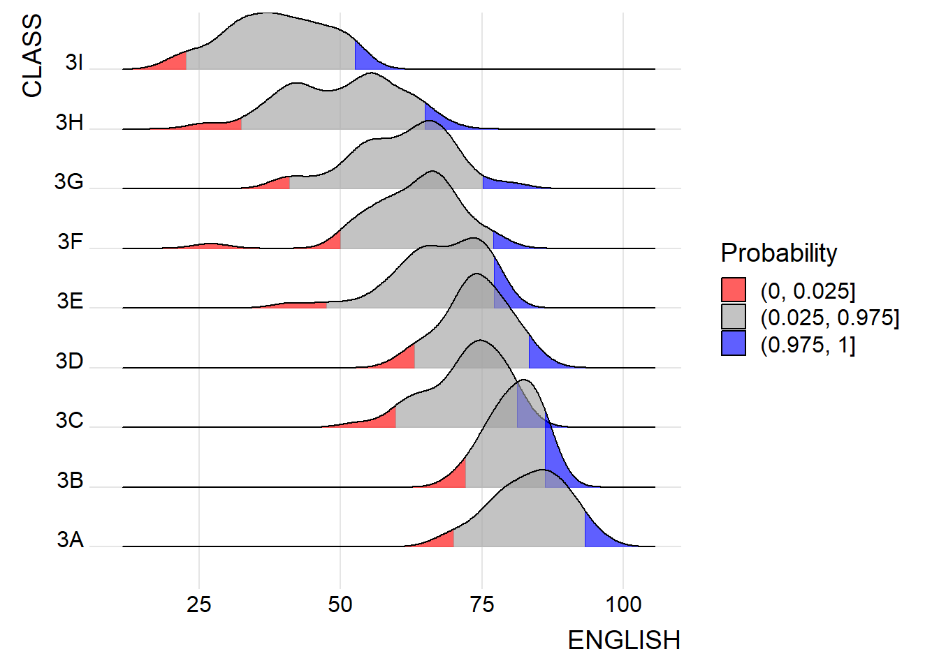
Raincloud Plot is a data visualisation techniques that produces a half-density to a distribution plot. It gets the name because the density plot is in the shape of a “raincloud”. The raincloud (half-density) plot enhances the traditional box-plot by highlighting multiple modalities (an indicator that groups may exist). The boxplot does not show where densities are clustered, but the raincloud plot does!
In this section, you will learn how to create a raincloud plot to visualise the distribution of English score by race. It will be created by using functions provided by ggdist and ggplot2 packages.
First, we will plot a Half-Eye graph by using stat_halfeye() of ggdist package.
This produces a Half Eye visualization, which is contains a half-density and a slab-interval.
ggplot(exam,
       aes(x = RACE,
           y = ENGLISH)) +
  stat_halfeye(adjust = 0.5,
               justification = -0.2,
               .width = 0,
               point_colour = NA)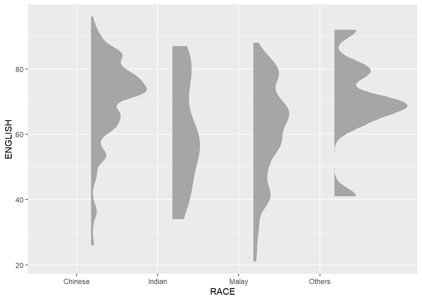
We remove the slab interval by setting .width = 0 and point_colour = NA.
Next, we will add the second geometry layer using geom_boxplot() of ggplot2. This produces a narrow boxplot. We reduce the width and adjust the opacity.
ggplot(exam,
       aes(x = RACE,
           y = ENGLISH)) +
  stat_halfeye(adjust = 0.5,
               justification = -0.2,
               .width = 0,
               point_colour = NA) +
  geom_boxplot(width = .20,
               outlier.shape = NA)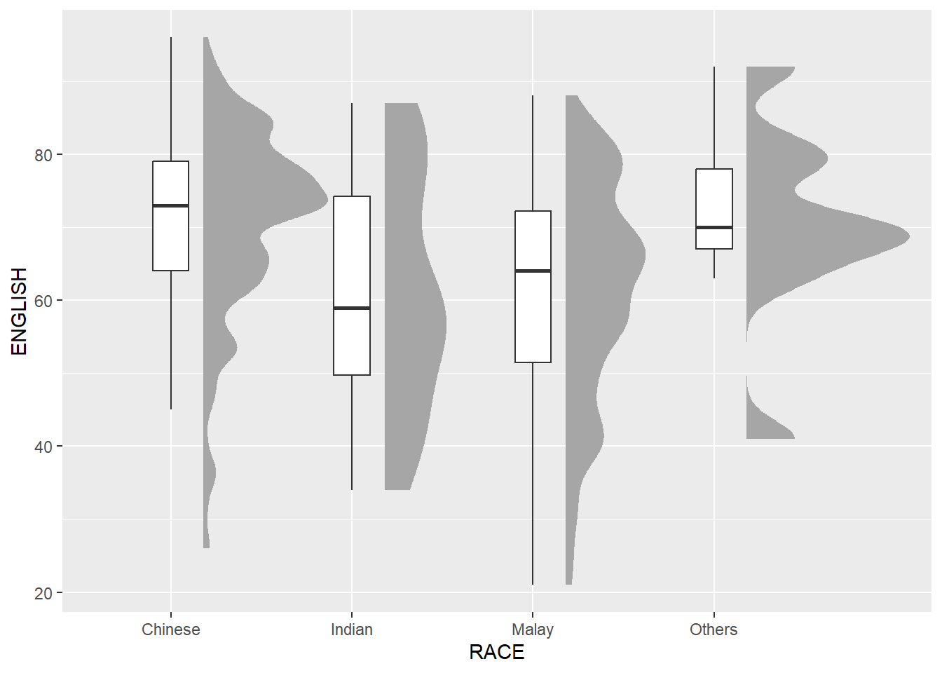
Next, we will add the third geometry layer using stat_dots() of ggdist package. This produces a half-dotplot, which is similar to a histogram that indicates the number of samples (number of dots) in each bin. We select side = “left” to indicate we want it on the left-hand side.
ggplot(exam,
       aes(x = RACE,
           y = ENGLISH)) +
  stat_halfeye(adjust = 0.5,
               justification = -0.2,
               .width = 0,
               point_colour = NA) +
  geom_boxplot(width = .20,
               outlier.shape = NA) +
  stat_dots(side = "left",
            justification = 1.2,
            binwidth = .5,
            dotsize = 2)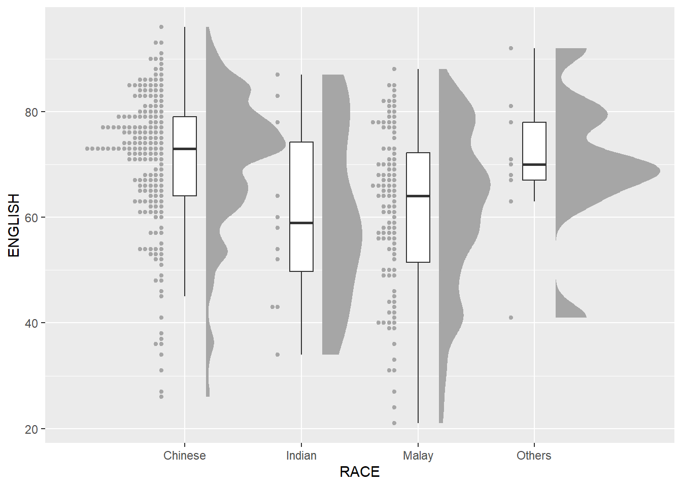
Lastly, coord_flip() of ggplot2 package will be used to flip the raincloud chart horizontally to give it the raincloud appearance. At the same time, theme_economist() of ggthemes package is used to give the raincloud chart a professional publishing standard look.
ggplot(exam,
       aes(x = RACE,
           y = ENGLISH)) +
  stat_halfeye(adjust = 0.5,
               justification = -0.2,
               .width = 0,
               point_colour = NA) +
  geom_boxplot(width = .20,
               outlier.shape = NA) +
  stat_dots(side = "left",
            justification = 1.2,
            binwidth = .5,
            dotsize = 1.5) +
  coord_flip() +
  theme_economist()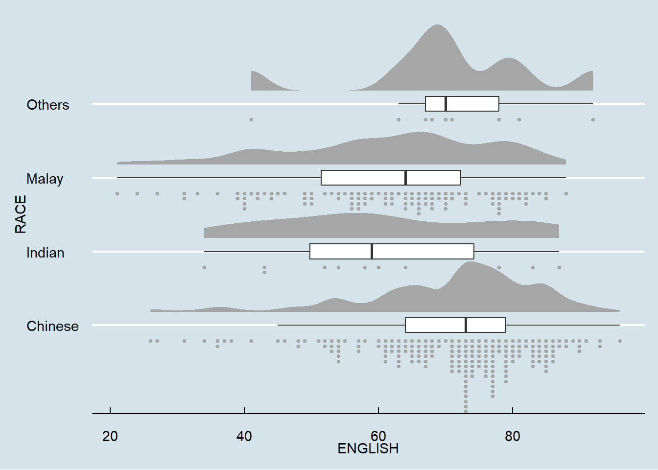
- Introducing Ridgeline Plots (formerly Joyplots)
- Claus O. Wilke Fundamentals of Data Visualization especially Chapter 6, 7, 8, 9 and 10.
- Allen M, Poggiali D, Whitaker K et al. “Raincloud plots: a multi-platform tool for robust data. visualization” [version 2; peer review: 2 approved]. Welcome Open Res 2021, pp. 4:63.
- Dots + interval stats and geoms
In this hands-on exercise, you will gain hands-on experience on using:
ggstatsplot package to create visual graphics with rich statistical information,
performance package to visualise model diagnostics, and
parameters package to visualise model parameters
ggstatsplot ![]() is an extension of ggplot2 package for creating graphics with details from statistical tests included in the information-rich plots themselves.
is an extension of ggplot2 package for creating graphics with details from statistical tests included in the information-rich plots themselves.
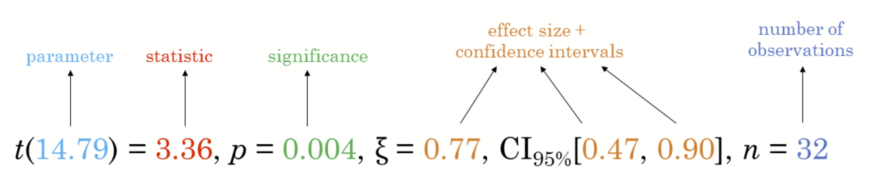
- To provide alternative statistical inference methods by default. - To follow best practices for statistical reporting. For all statistical tests reported in the plots, the default template abides by the [APA](https://my.ilstu.edu/~jhkahn/apastats.html) gold standard for statistical reporting. For example, here are results from a robust t-test:
In this exercise, ggstatsplot and tidyverse will be used.
pacman::p_load(ggstatsplot, tidyverse)head(exam, 10)# A tibble: 10 × 7
ID CLASS GENDER RACE ENGLISH MATHS SCIENCE
<chr> <chr> <chr> <chr> <dbl> <dbl> <dbl>
1 Student321 3I Male Malay 21 9 15
2 Student305 3I Female Malay 24 22 16
3 Student289 3H Male Chinese 26 16 16
4 Student227 3F Male Chinese 27 77 31
5 Student318 3I Male Malay 27 11 25
6 Student306 3I Female Malay 31 16 16
7 Student313 3I Male Chinese 31 21 25
8 Student316 3I Male Malay 31 18 27
9 Student312 3I Male Malay 33 19 15
10 Student297 3H Male Indian 34 49 37In the code chunk below, gghistostats() is used to to build an visual of one-sample test on English scores.
set.seed(1234)

gghistostats(
  data = exam,
  x = ENGLISH,
  type = "bayes",
  test.value = 60,
  xlab = "English scores"
)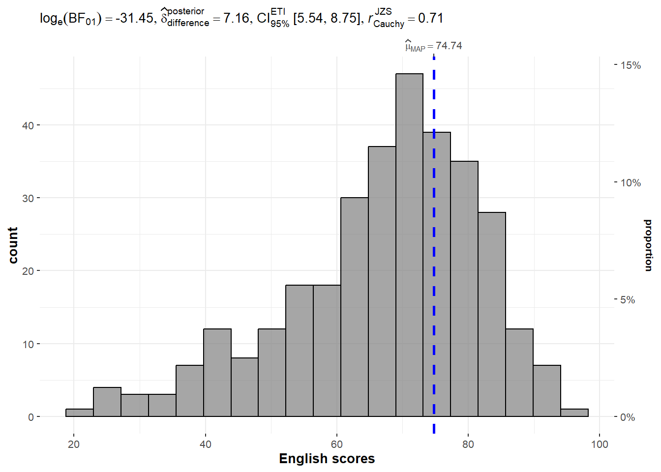
Default information: - statistical details - Bayes Factor - sample sizes - distribution summary
A Bayes factor is the ratio of the likelihood of one particular hypothesis to the likelihood of another. It can be interpreted as a measure of the strength of evidence in favor of one theory among two competing theories.
That’s because the Bayes factor gives us a way to evaluate the data in favor of a null hypothesis, and to use external information to do so. It tells us what the weight of the evidence is in favor of a given hypothesis.
When we are comparing two hypotheses, H1 (the alternate hypothesis) and H0 (the null hypothesis), the Bayes Factor is often written as B10. It can be defined mathematically as
- The Schwarz criterion is one of the easiest ways to calculate rough approximation of the Bayes Factor.
A Bayes Factor can be any positive number. One of the most common interpretations is this one—first proposed by Harold Jeffereys (1961) and slightly modified by Lee and Wagenmakers in 2013:
In the code chunk below, ggbetweenstats() is used to build a visual for two-sample mean test of Maths scores by gender.
ggbetweenstats(
  data = exam,
  x = GENDER,
  y = MATHS,
  type = "np",
  messages = FALSE
)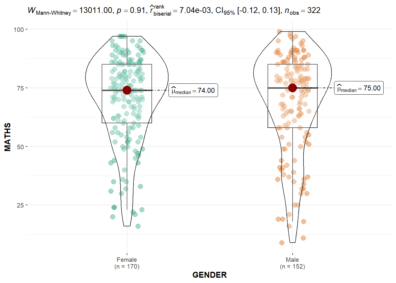
Default information: - statistical details - Bayes Factor - sample sizes - distribution summary
In the code chunk below, ggbetweenstats() is used to build a visual for One-way ANOVA test on English score by race.
ggbetweenstats(
  data = exam,
  x = RACE,
  y = ENGLISH,
  type = "p",
  mean.ci = TRUE,
  pairwise.comparisons = TRUE,
  pairwise.display = "s",
  p.adjust.method = "fdr",
  messages = FALSE
)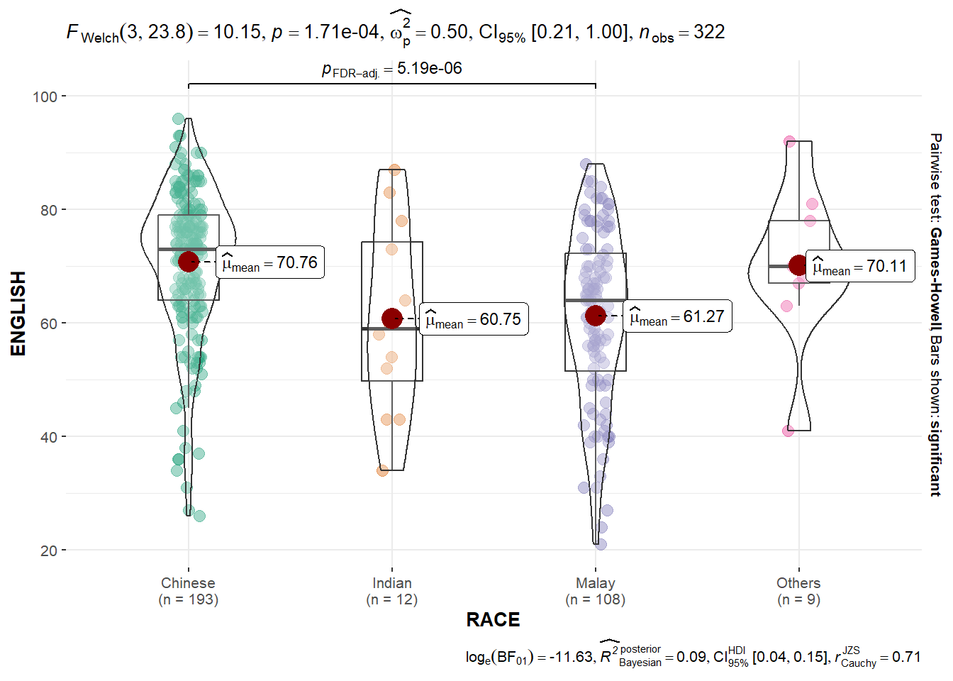
“ns” → only non-significant
“s” → only significant
“all” → everything
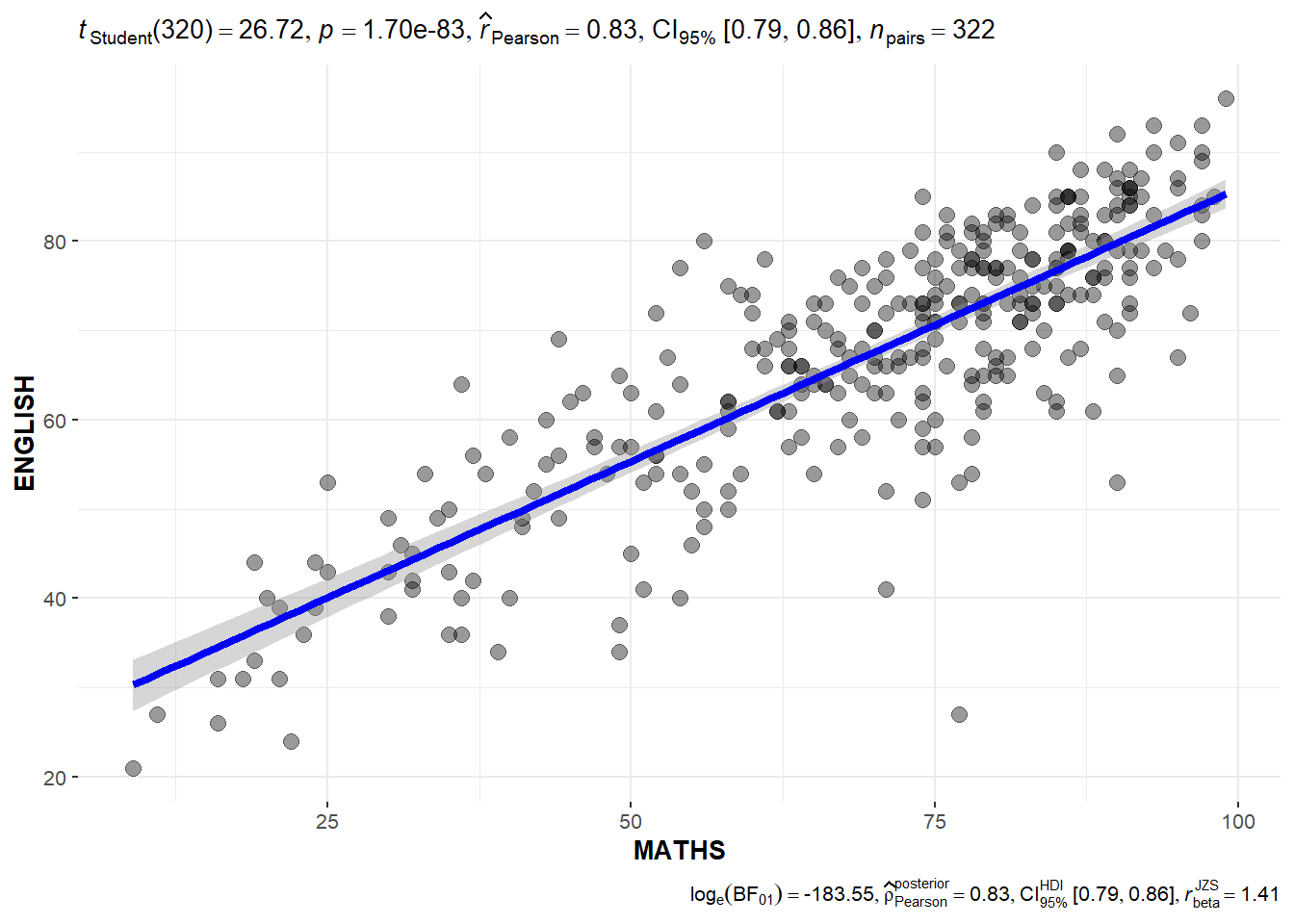
In the code chunk below, ggscatterstats() is used to build a visual for Significant Test of Correlation between Maths scores and English scores.
ggscatterstats(
  data = exam,
  x = MATHS,
  y = ENGLISH,
  marginal = FALSE,
  )
In the code chunk below, the Maths scores is binned into a 4-class variable by using cut().
exam1 <- exam %>%
  mutate(MATHS_bins =
           cut(MATHS,
               breaks = c(0,60,75,85,100))
)
In this code chunk below ggbarstats() is used to build a visual for Significant Test of Association.
ggbarstats(exam1,
           x = MATHS_bins,
           y = GENDER)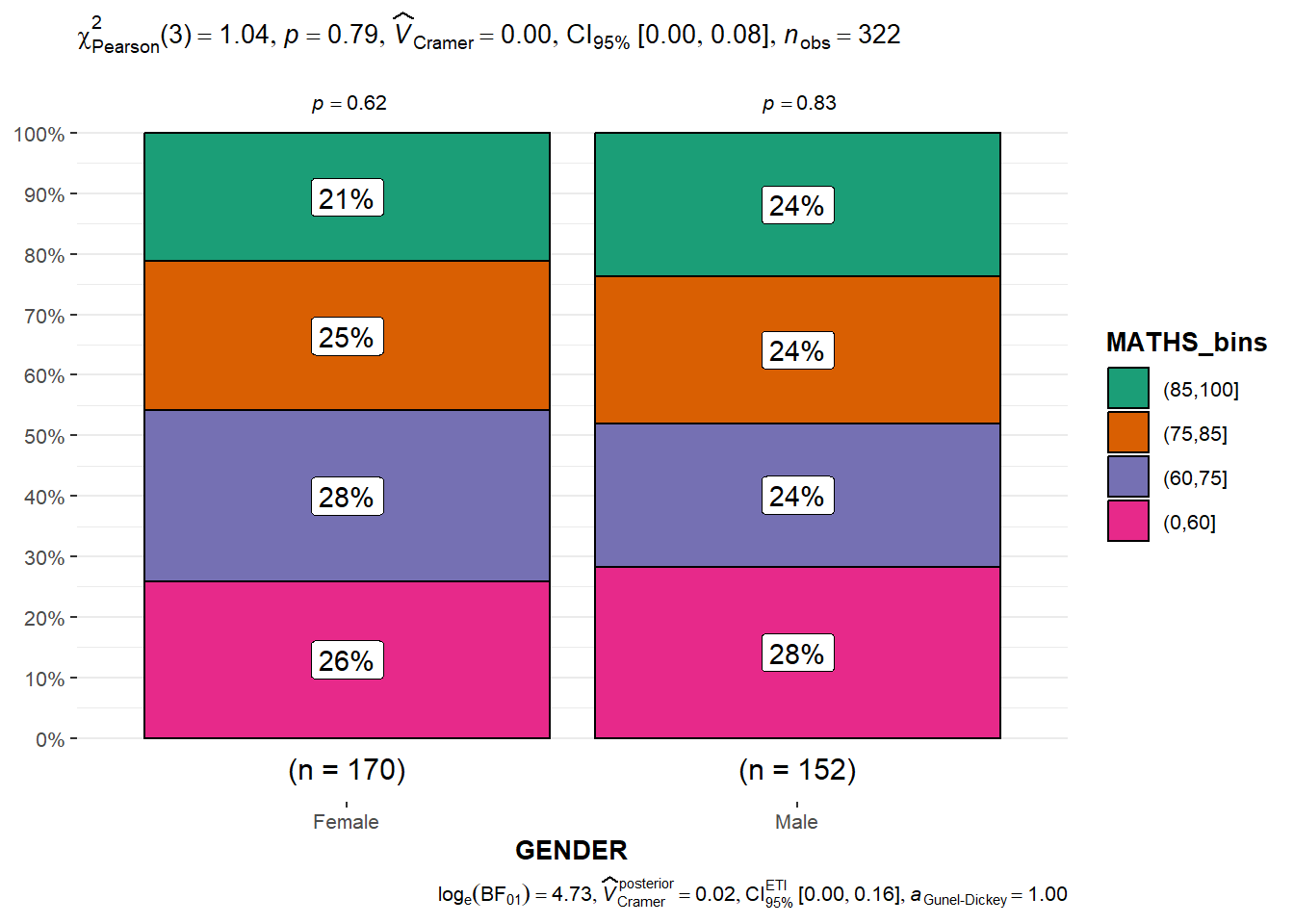
Visualising uncertainty is relatively new in statistical graphics. In this chapter, you will gain hands-on experience on creating statistical graphics for visualising uncertainty. By the end of this chapter you will be able:
- to plot statistics error bars by using ggplot2,
- to plot interactive error bars by combining ggplot2, plotly and DT,
- to create advanced by using ggdist, and
- to create hypothetical outcome plots (HOPs) by using ungeviz package.
For the purpose of this exercise, the following R packages will be used, they are:
- tidyverse, a family of R packages for data science process,
- plotly for creating interactive plot,
- gganimate for creating animation plot,
- DT for displaying interactive html table,
- crosstalk for for implementing cross-widget interactions (currently, linked brushing and filtering), and
- ggdist for visualising distribution and uncertainty.
pacman::p_load(plotly, crosstalk, DT,
               ggdist, ggridges, colorspace,
               gganimate, tidyverse)
For the purpose of this exercise, Exam_data.csv will be used.
exam <- read_csv("data/Exam_data.csv")A point estimate is a single number, such as a mean. Uncertainty, on the other hand, is expressed as standard error, confidence interval, or credible interval.
- Don’t confuse the uncertainty of a point estimate with the variation in the sample
In this section, you will learn how to plot error bars of maths scores by race by using data provided in exam tibble data frame.
Firstly, code chunk below will be used to derive the necessary summary statistics.
my_sum <- exam %>%
  group_by(RACE) %>%
  summarise(
    n=n(),
    mean=mean(MATHS),
    sd=sd(MATHS)
    ) %>%
mutate(se=sd/sqrt(n-1))group_by()of dplyr package is used to group the observation by RACE,summarise()is used to compute the count of observations, mean, standard deviationmutate()is used to derive standard error of Maths by RACE, and- the output is save as a tibble data table called my_sum.
Next, the code chunk below will be used to display my_sum tibble data frame in an html table format.
knitr::kable(head(my_sum), format = 'html')| RACE | n | mean | sd | se |
|---|---|---|---|---|
| Chinese | 193 | 76.50777 | 15.69040 | 1.132357 |
| Indian | 12 | 60.66667 | 23.35237 | 7.041005 |
| Malay | 108 | 57.44444 | 21.13478 | 2.043177 |
| Others | 9 | 69.66667 | 10.72381 | 3.791438 |
Now we are ready to plot the standard error bars of mean maths score by race as shown below.
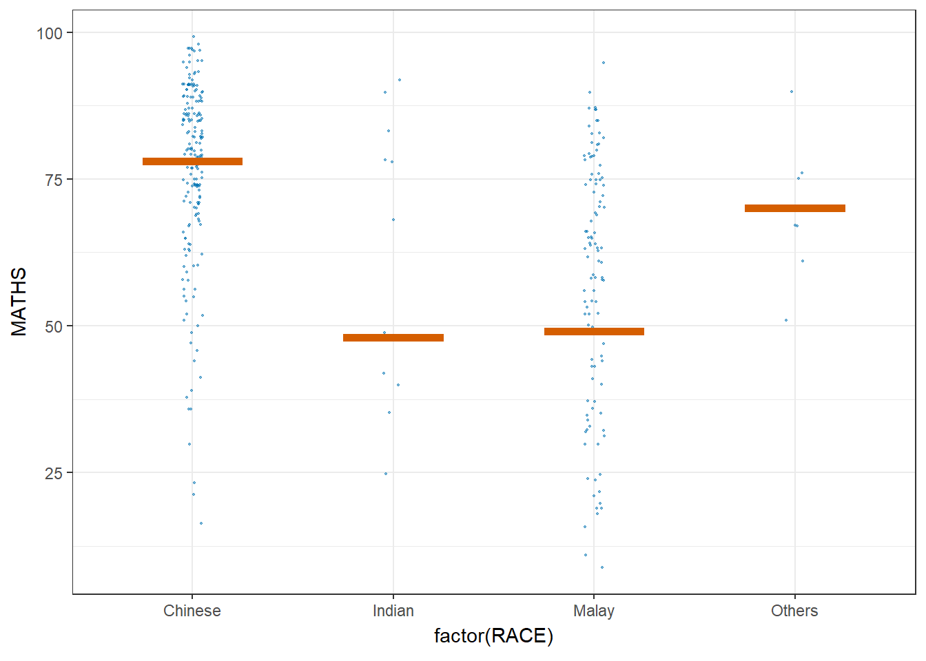
ggplot(my_sum) +
  geom_errorbar(
    aes(x=RACE,
        ymin=mean-se,
        ymax=mean+se),
    width=0.2,
    colour="black",
    alpha=0.9,
    linewidth=0.5) +
  geom_point(aes
           (x=RACE,
            y=mean),
           stat="identity",
           color="red",
           size = 1.5,
           alpha=1) +
  ggtitle("Standard error of mean maths score by rac")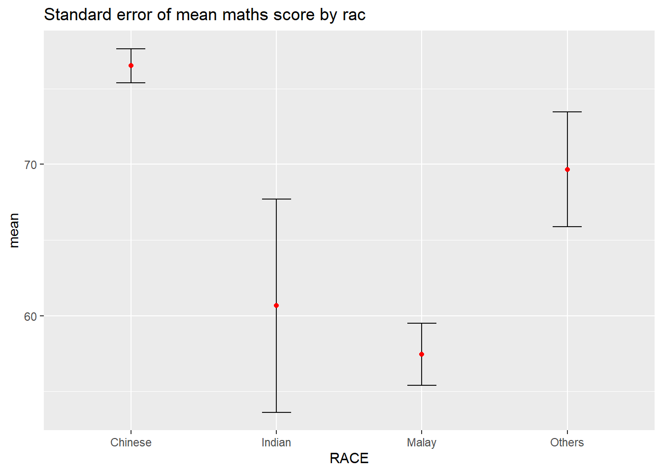
Instead of plotting the standard error bar of point estimates, we can also plot the confidence intervals of mean maths score by race.
ggplot(my_sum) +
  geom_errorbar(
    aes(x=reorder(RACE, -mean),
        ymin=mean-1.96*se,
        ymax=mean+1.96*se),
    width=0.2,
    colour="black",
    alpha=0.9,
    linewidth=0.5) +
  geom_point(aes
           (x=RACE,
            y=mean),
           stat="identity",
           color="red",
           size = 1.5,
           alpha=1) +
  labs(x = "Maths score",
       title = "95% confidence interval of mean maths score by race")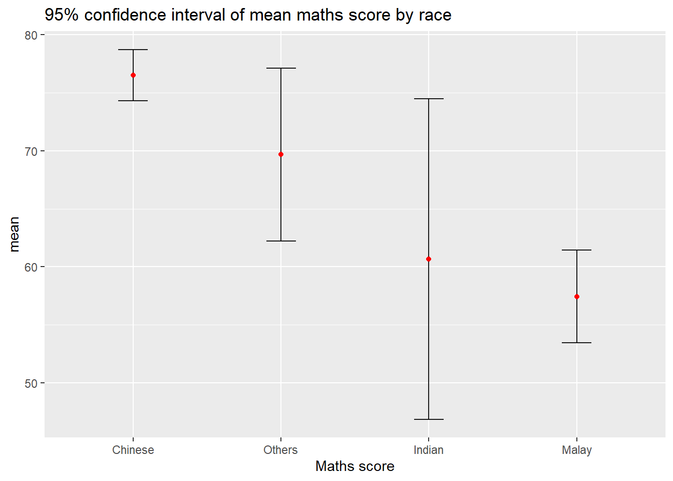
In this section, you will learn how to plot interactive error bars for the 99% confidence interval of mean maths score by race as shown in the figure below.
shared_df = SharedData$new(my_sum)
bscols(widths = c(4,8),
ggplotly((ggplot(shared_df) +
geom_errorbar(aes(
x=reorder(RACE, -mean),
ymin=mean-2.58*se,
ymax=mean+2.58*se),
width=0.2,
colour="black",
alpha=0.9,
size=0.5) +
geom_point(aes(
x=RACE,
y=mean,
text = paste("Race:", `RACE`,
"<br>N:", `n`,
"<br>Avg. Scores:", round(mean, digits = 2),
"<br>95% CI:[",
round((mean-2.58*se), digits = 2), ",",
round((mean+2.58*se), digits = 2),"]")),
stat="identity",
color="red",
size = 1.5,
alpha=1) +
xlab("Race") +
ylab("Average Scores") +
theme_minimal() +
theme(axis.text.x = element_text(
angle = 45, vjust = 0.5, hjust=1)) +
ggtitle("99% Confidence interval of average /<br>maths scores by race")),
tooltip = "text"),
DT::datatable(shared_df,
rownames = FALSE,
class="compact",
width="100%",
options = list(pageLength = 10,
scrollX=T),
colnames = c("No. of pupils",
"Avg Scores",
"Std Dev",
"Std Error")) %>%
formatRound(columns=c('mean', 'sd', 'se'),
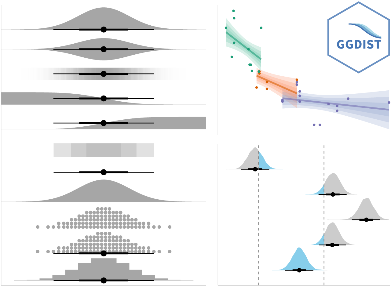
digits=2))ggdist is an R package that provides a flexible set of ggplot2 geoms and stats designed especially for visualising distributions and uncertainty.
It is designed for both frequentist and Bayesian uncertainty visualization, taking the view that uncertainty visualization can be unified through the perspective of distribution visualization:
for frequentist models, one visualises confidence distributions or bootstrap distributions (see vignette(“freq-uncertainty-vis”));
for Bayesian models, one visualises probability distributions (see the tidybayes package, which builds on top of ggdist).
In the code chunk below, stat_pointinterval() of ggdist is used to build a visual for displaying distribution of maths scores by race.
exam %>%
  ggplot(aes(x = RACE,
             y = MATHS)) +
  stat_pointinterval() +
  labs(
    title = "Visualising confidence intervals of mean math score",
    subtitle = "Mean Point + Multiple-interval plot")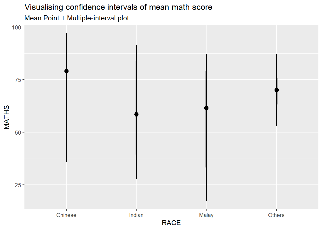
This function comes with many arguments, students are advised to read the syntax reference for more detail.
For example, in the code chunk below the following arguments are used:
- .width = 0.95
- .point = median
- .interval = qi
exam %>%
  ggplot(aes(x = RACE, y = MATHS)) +
  stat_pointinterval(.width = 0.95,
  .point = median,
  .interval = qi) +
  labs(
    title = "Visualising confidence intervals of median math score",
    subtitle = "Median Point + Multiple-interval plot")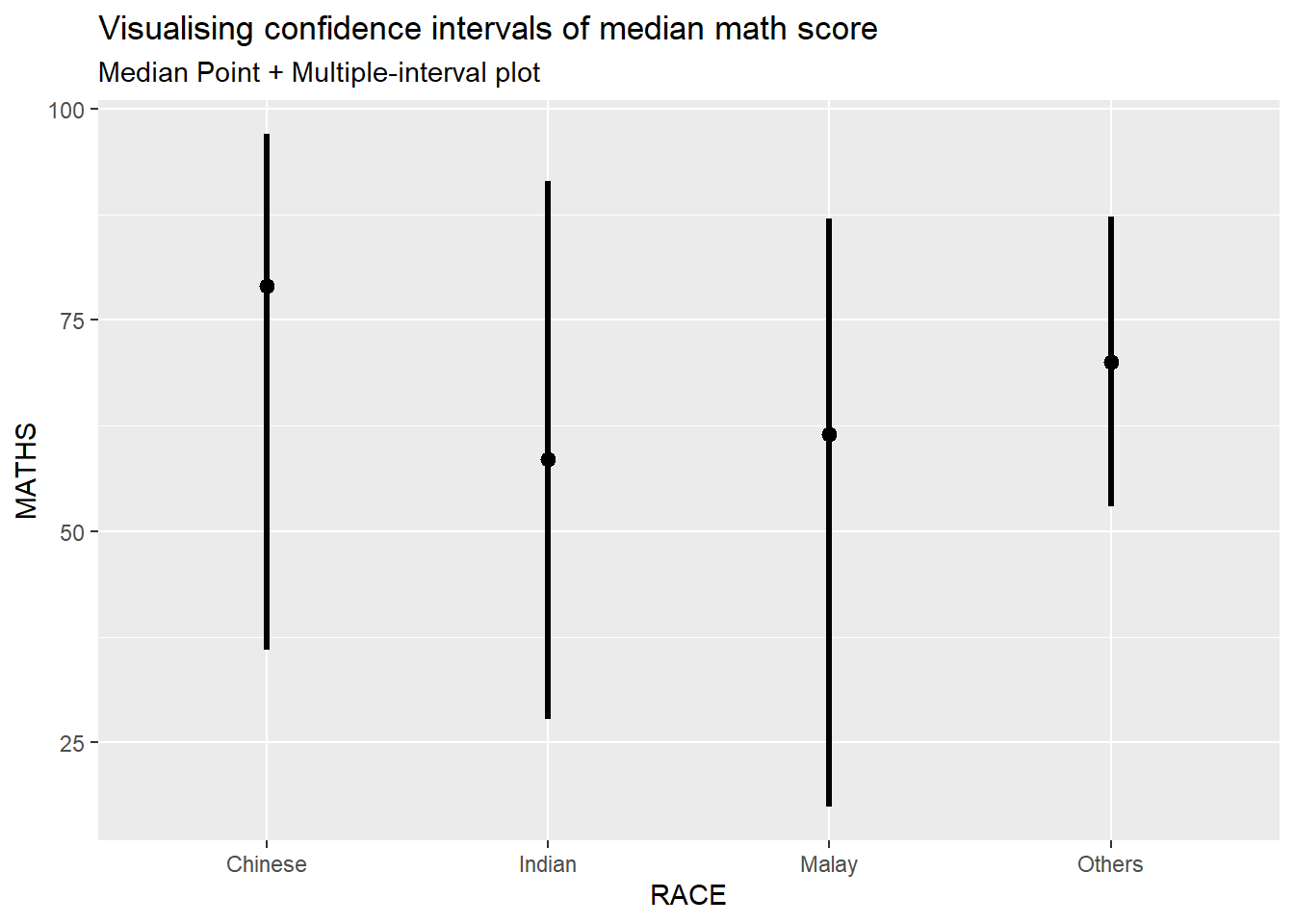
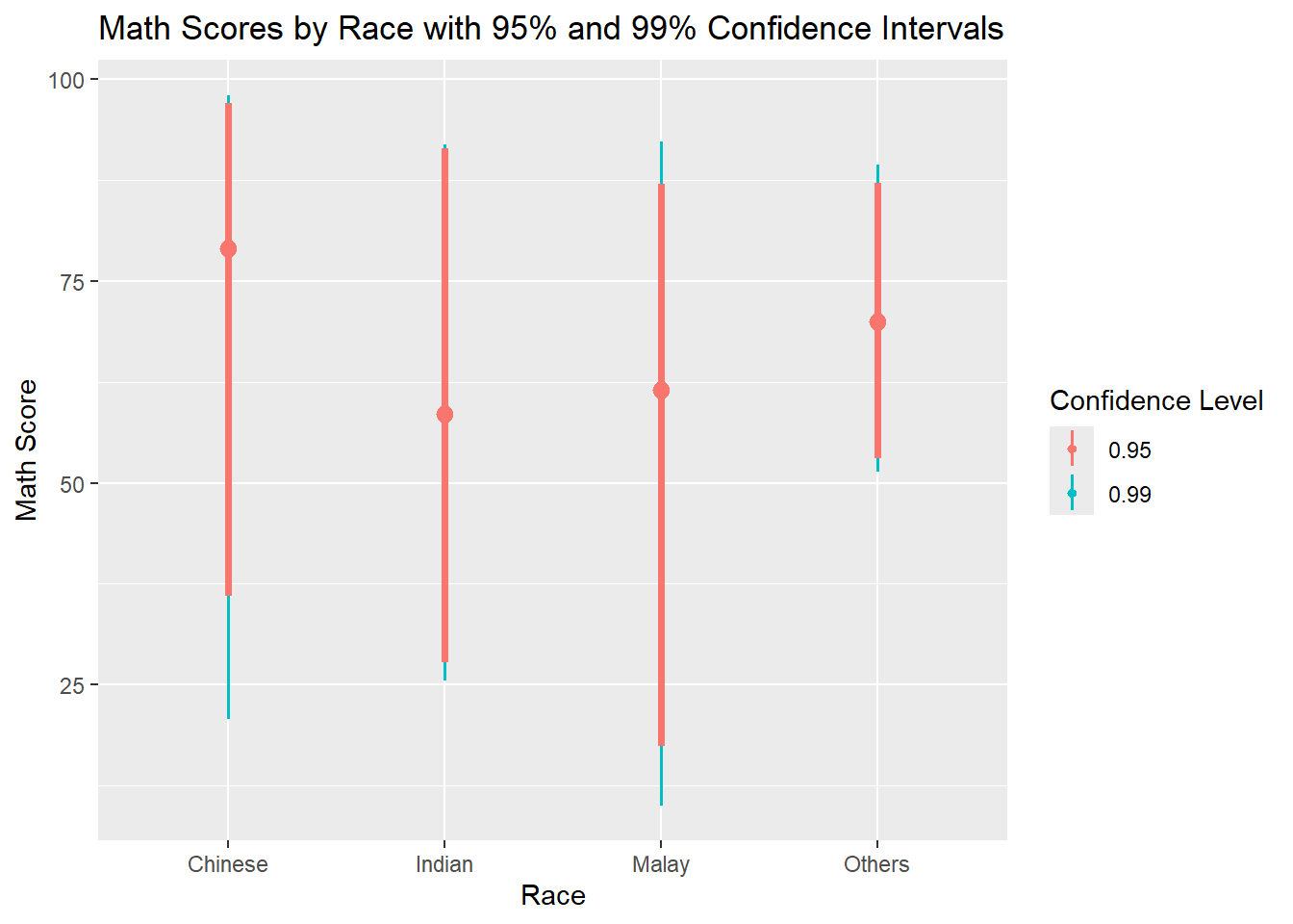
exam %>%
  ggplot(aes(x = RACE, y = MATHS)) +
  stat_pointinterval(
    aes(color = after_stat(factor(.width))),   # Add color inside stat
    .width = c(0.95, 0.99)
  ) +
  labs(
    title = "Math Scores by Race with 95% and 99% Confidence Intervals",
    color = "Confidence Level",
    x = "Race",
    y = "Math Score"
  )
In the code chunk below, stat_gradientinterval() of ggdist is used to build a visual for displaying distribution of maths scores by race.
exam %>%
  ggplot(aes(x = RACE,
             y = MATHS)) +
  stat_gradientinterval(
    fill = "skyblue",
    show.legend = TRUE
  ) +
  labs(
    title = "Visualising confidence intervals of mean math score",
    subtitle = "Gradient + interval plot")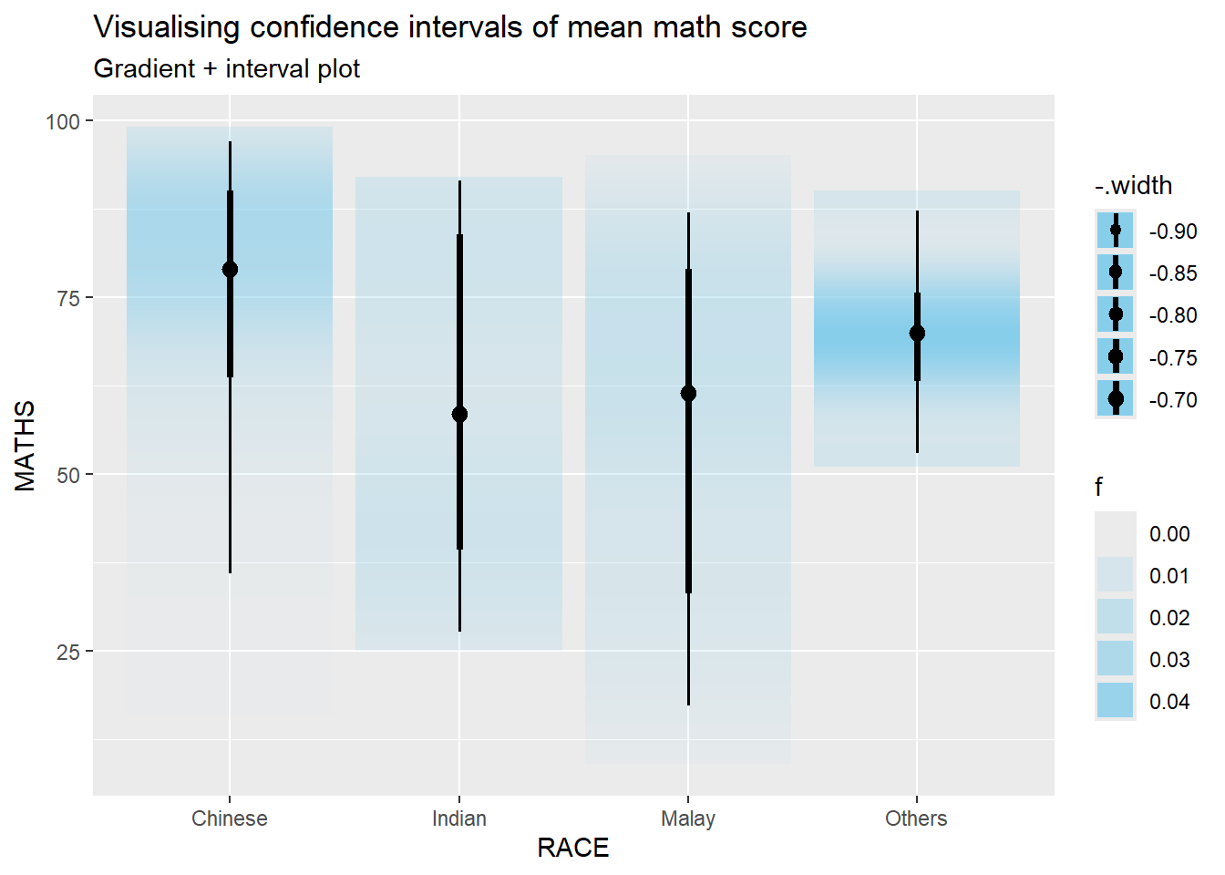
devtools::install_github("wilkelab/ungeviz")library(ungeviz)Next, the code chunk below will be used to build the HOPs.
ggplot(data = exam,
       (aes(x = factor(RACE),
            y = MATHS))) +
  geom_point(position = position_jitter(
    height = 0.3,
    width = 0.05),
    size = 0.4,
    color = "#0072B2",
    alpha = 1/2) +
  geom_hpline(data = sampler(25,
                             group = RACE),
              height = 0.6,
              color = "#D55E00") +
  theme_bw() +
  transition_states(.draw, 1, 3)