In this exercise, we will create interactive data visualisations by using functions provided by ggiraph and plotlyr packages.
pacman::p_load(ggiraph, plotly, patchwork, DT, tidyverse) - ggiraph for making ‘ggplot’ graphics interactive.
- plotly, R library for plotting interactive statistical graphs.
- DT provides an R interface to the JavaScript library DataTables that create interactive table on html page.
- tidyverse, a family of modern R packages specially designed to support data science, analysis and communication task including creating static statistical graphs.
- patchwork for combining multiple ggplot2 graphs into one figure.
The code chunk below read_csv() of readr package is used to import Exam_data.csv data file into R and save it as an tibble data frame called exam_data.
exam_data <- read_csv("data/Exam_data.csv")ggiraph ![]() is an htmlwidget and a ggplot2 extension. It allows ggplot graphics to be interactive.
is an htmlwidget and a ggplot2 extension. It allows ggplot graphics to be interactive.
Interactive is made with ggplot geometries that can understand three arguments:
- Tooltip: a column of data-sets that contain tooltips to be displayed when the mouse is over elements.
- Onclick: a column of data-sets that contain a JavaScript function to be executed when elements are clicked.
- Data_id: a column of data-sets that contain an id to be associated with elements.
If it used within a shiny application, elements associated with an id (data_id) can be selected and manipulated on client and server sides. Refer to this article for more detail explanation.
Below shows a typical code chunk to plot an interactive statistical graph by using ggiraph package. Notice that the code chunk consists of two parts. First, an ggplot object will be created. Next, girafe() of ggiraph will be used to create an interactive svg object
p <- ggplot(data=exam_data,
aes(x = MATHS)) +
geom_dotplot_interactive(
aes(tooltip = ID),
stackgroups = TRUE,
binwidth = 1,
method = "histodot") +
scale_y_continuous(NULL,
breaks = NULL)
girafe(
ggobj = p,
width_svg = 6,
height_svg = 6*0.618
)Notice that two steps are involved. First, an interactive version of ggplot2 geom (i.e. geom_dotplot_interactive()) will be used to create the basic graph. Then, girafe() will be used to generate an svg object to be displayed on an html page.
By hovering the mouse pointer on a data point of interest, the student’s ID will be displayed.
The content of the tooltip can be customised by including a list object as shown in the code chunk below.
exam_data$tooltip <- c(paste0(
"Name = ", exam_data$ID,
"\n Class = ", exam_data$CLASS,
"\n Gender = ", exam_data$GENDER))
p <- ggplot(data=exam_data,
aes(x = MATHS)) +
geom_dotplot_interactive(
aes(tooltip = exam_data$tooltip),
stackgroups = TRUE,
binwidth = 1,
method = "histodot") +
scale_y_continuous(NULL,
breaks = NULL)
girafe(
ggobj = p,
width_svg = 8,
height_svg = 8*0.618
)The first three lines of codes in the code chunk create a new field called tooltip. At the same time, it populates text in ID, CLASS and GENDER fields into the newly created field. The tooltip field is then called under geom_dotplot_interactive as an aesthetic mapping with the tooltip argument.
Code chunk below uses opts_tooltip() of ggiraph to customise tooltip rendering with CSS declarations.
tooltip_css <- "background-color:white; #<<
font-style:bold; color:black;" #<<
p <- ggplot(data=exam_data,
aes(x = MATHS)) +
geom_dotplot_interactive(
aes(tooltip = exam_data$tooltip),
stackgroups = TRUE,
binwidth = 1,
method = "histodot") +
scale_y_continuous(NULL,
breaks = NULL)
girafe(
ggobj = p,
width_svg = 6,
height_svg = 6*0.618,
options = list( #<<
opts_tooltip( #<<
css = tooltip_css)) #<<
) Notice that the background color of the tooltip is now white and font color is black, whereas the default tooltip has a black background color with white font color.
- Refer to Customizing girafe objects to learn more about how to customise ggiraph objects.
Code chunk below shows an advanced way to customise tooltip. In this example, a function is used to compute 90% confident interval of the mean. The derived statistics are then displayed in the tooltip.
tooltip <- function(y, ymax, accuracy = .01) {
mean <- scales::number(y, accuracy = accuracy)
sem <- scales::number(ymax - y, accuracy = accuracy)
paste("Mean maths scores:", mean, "+/-", sem)
}
gg_point <- ggplot(data=exam_data,
aes(x = RACE),
) +
stat_summary(aes(y = MATHS,
tooltip = after_stat(
tooltip(y, ymax))),
fun.data = "mean_se",
geom = GeomInteractiveCol,
fill = "light blue"
) +
stat_summary(aes(y = MATHS),
fun.data = mean_se,
geom = "errorbar", width = 0.2, size = 0.2
)
girafe(ggobj = gg_point,
width_svg = 8,
height_svg = 8*0.618)Code chunk below shows the second interactive feature of ggiraph, namely data_id.
p <- ggplot(data=exam_data,
aes(x = MATHS)) +
geom_dotplot_interactive(
aes(data_id = CLASS),
stackgroups = TRUE,
binwidth = 1,
method = "histodot") +
scale_y_continuous(NULL,
breaks = NULL)
girafe(
ggobj = p,
width_svg = 6,
height_svg = 6*0.618
) Interactivity: Elements associated with a data_id (i.e CLASS) will be highlighted upon mouse over.
In the code chunk below, css codes are used to change the highlighting effect.
p <- ggplot(data=exam_data,
aes(x = MATHS)) +
geom_dotplot_interactive(
aes(data_id = CLASS),
stackgroups = TRUE,
binwidth = 1,
method = "histodot") +
scale_y_continuous(NULL,
breaks = NULL)
girafe(
ggobj = p,
width_svg = 6,
height_svg = 6*0.618,
options = list(
opts_hover(css = "fill: #202020;"),
opts_hover_inv(css = "opacity:0.2;")
)
) Interactivity: Elements associated with a data_id (i.e CLASS) will be highlighted upon mouse over.
Note: Different from previous example, in this example the ccs customisation request are encoded directly.
There are time that we want to combine tooltip and hover effect on the interactive statistical graph as shown in the code chunk below.
p <- ggplot(data=exam_data,
aes(x = MATHS)) +
geom_dotplot_interactive(
aes(tooltip = CLASS,
data_id = CLASS),
stackgroups = TRUE,
binwidth = 1,
method = "histodot") +
scale_y_continuous(NULL,
breaks = NULL)
girafe(
ggobj = p,
width_svg = 6,
height_svg = 6*0.618,
options = list(
opts_hover(css = "fill: #202020;"),
opts_hover_inv(css = "opacity:0.2;")
)
) Interactivity: Elements associated with a data_id (i.e CLASS) will be highlighted upon mouse over. At the same time, the tooltip will show the CLASS.
p <- ggplot(data=exam_data,
aes(x = MATHS)) +
geom_dotplot_interactive(
aes(tooltip = GENDER,
data_id = GENDER),
stackgroups = TRUE,
binwidth = 1,
method = "histodot") +
scale_y_continuous(NULL,
breaks = NULL)
girafe(
ggobj = p,
width_svg = 6,
height_svg = 6*0.618,
options = list(
opts_hover(css = "fill: #202020;"),
opts_hover_inv(css = "opacity:0.2;")
)
) onclick argument of ggiraph provides hotlink interactivity on the web.
The code chunk below shown an example of onclick.
exam_data$onclick <- sprintf("window.open(\"%s%s\")",
"https://www.moe.gov.sg/schoolfinder?journey=Primary%20school",
as.character(exam_data$ID))
p <- ggplot(data=exam_data,
aes(x = MATHS)) +
geom_dotplot_interactive(
aes(onclick = onclick),
stackgroups = TRUE,
binwidth = 1,
method = "histodot") +
scale_y_continuous(NULL,
breaks = NULL)
girafe(
ggobj = p,
width_svg = 6,
height_svg = 6*0.618) Interactivity: Web document link with a data object will be displayed on the web browser upon mouse click.
Coordinated multiple views methods has been implemented in the data visualisation below.
Notice that when a data point of one of the dotplot is selected, the corresponding data point ID on the second data visualisation will be highlighted too.
In order to build a coordinated multiple views as shown in the example above, the following programming strategy will be used:
Appropriate interactive functions of ggiraph will be used to create the multiple views.
patchwork function of patchwork package will be used inside girafe function to create the interactive coordinated multiple views.
p1 <- ggplot(data=exam_data,
aes(x = MATHS)) +
geom_dotplot_interactive(
aes(data_id = ID),
stackgroups = TRUE,
binwidth = 1,
method = "histodot") +
coord_cartesian(xlim=c(0,100)) +
scale_y_continuous(NULL,
breaks = NULL)
p2 <- ggplot(data=exam_data,
aes(x = ENGLISH)) +
geom_dotplot_interactive(
aes(data_id = ID),
stackgroups = TRUE,
binwidth = 1,
method = "histodot") +
coord_cartesian(xlim=c(0,100)) +
scale_y_continuous(NULL,
breaks = NULL)
girafe(code = print(p1 + p2),
width_svg = 6,
height_svg = 3,
options = list(
opts_hover(css = "fill: #202020;"),
opts_hover_inv(css = "opacity:0.2;")
)
) The data_id aesthetic is critical to link observations between plots and the tooltip aesthetic is optional but nice to have when mouse over a point.
Plotly’s R graphing library create interactive web graphics from ggplot2 graphs and/or a custom interface to the (MIT-licensed) JavaScript library plotly.js inspired by the grammar of graphics. Different from other plotly platform, plot.R is free and open source.
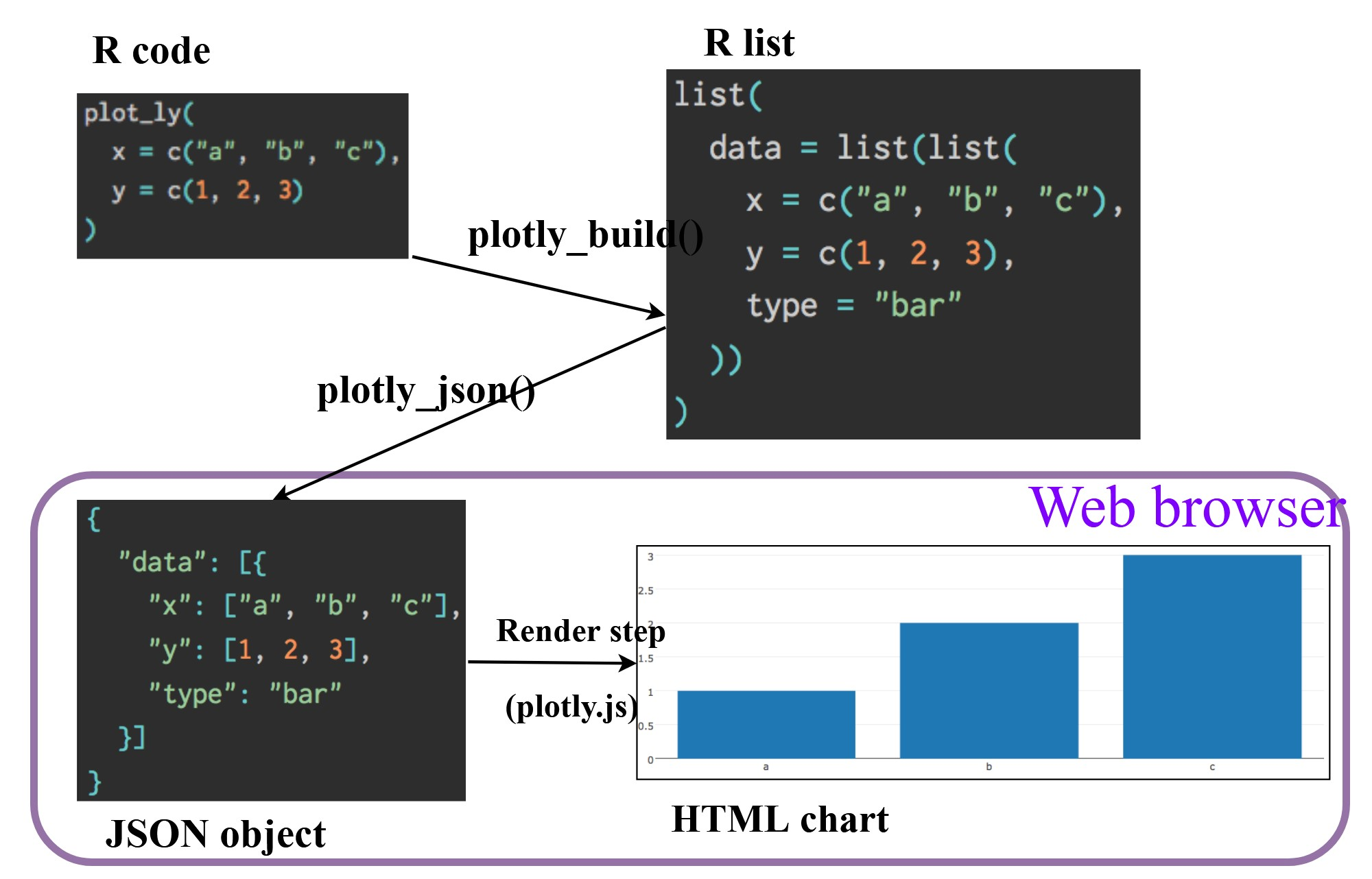
There are two ways to create interactive graph by using plotly, they are:
- by using plot_ly(), and
- by using ggplotly()
The tabset below shows an example a basic interactive plot created by using plot_ly().
plot_ly(data = exam_data,
x = ~MATHS,
y = ~ENGLISH)In the code chunk below, color argument is mapped to a qualitative visual variable (i.e. RACE).
plot_ly(data = exam_data,
x = ~ENGLISH,
y = ~MATHS,
color = ~RACE)The code chunk below plots an interactive scatter plot by using ggplotly().
p <- ggplot(data=exam_data,
aes(x = MATHS,
y = ENGLISH)) +
geom_point(size=1) +
coord_cartesian(xlim=c(0,100),
ylim=c(0,100))
ggplotly(p)The creation of a coordinated linked plot by using plotly involves three steps:
highlight_key()of plotly package is used as shared data.- two scatterplots will be created by using ggplot2 functions.
- lastly, subplot() of plotly package is used to place them next to each other side-by-side.
d <- highlight_key(exam_data)
p1 <- ggplot(data=d,
aes(x = MATHS,
y = ENGLISH)) +
geom_point(size=1) +
coord_cartesian(xlim=c(0,100),
ylim=c(0,100))
p2 <- ggplot(data=d,
aes(x = MATHS,
y = SCIENCE)) +
geom_point(size=1) +
coord_cartesian(xlim=c(0,100),
ylim=c(0,100))
subplot(ggplotly(p1),
ggplotly(p2))Crosstalk is an add-on to the htmlwidgets package. It extends htmlwidgets with a set of classes, functions, and conventions for implementing cross-widget interactions (currently, linked brushing and filtering).
A wrapper of the JavaScript Library DataTables
Data objects in R can be rendered as HTML tables using the JavaScript library ‘DataTables’ (typically via R Markdown or Shiny).
DT::datatable(exam_data, class= "compact")d <- highlight_key(exam_data)
p <- ggplot(d,
aes(ENGLISH,
MATHS)) +
geom_point(size=1) +
coord_cartesian(xlim=c(0,100),
ylim=c(0,100))
gg <- highlight(ggplotly(p),
"plotly_selected")
crosstalk::bscols(gg,
DT::datatable(d),
widths = 5) Things to learn from the code chunk:
highlight() is a function of plotly package. It sets a variety of options for brushing (i.e., highlighting) multiple plots. These options are primarily designed for linking multiple plotly graphs, and may not behave as expected when linking plotly to another htmlwidget package via crosstalk. In some cases, other htmlwidgets will respect these options, such as persistent selection in leaflet.
bscols() is a helper function of crosstalk package. It makes it easy to put HTML elements side by side. It can be called directly from the console but is especially designed to work in an R Markdown document. Warning: This will bring in all of Bootstrap!.
This link provides online version of the reference guide and several useful articles. Use this link to download the pdf version of the reference guide.
- How to Plot With Ggiraph
- Interactive map of France with ggiraph
- Custom interactive sunbursts with ggplot in R
This link provides code example on how ggiraph is used to interactive graphs for Swiss Olympians - the solo specialists.
- Getting Started with Plotly in R
A collection of plotly R graphs are available via this link.
Carson Sievert (2020) Interactive web-based data visualization with R, plotly, and shiny, Chapman and Hall/CRC is the best resource to learn plotly for R. The online version is available via this link
Plotly R Figure Reference provides a comprehensive discussion of each visual representations.
Plotly R Library Fundamentals is a good place to learn the fundamental features of Plotly’s R API.
- Getting Started
Visit this link for a very interesting implementation of gganimate by your senior.
- Creating a composite gif with multiple gganimate panels
When telling a visually-driven data story, animated graphics tends to attract the interest of the audience and make deeper impression than static graphics. In this hands-on exercise, you will learn how to create animated data visualisation by using gganimate and plotly r packages. At the same time, you will also learn how to (i) reshape data by using tidyr package, and (ii) process, wrangle and transform data by using dplyr package.
When creating animations, the plot does not actually move. Instead, many individual plots are built and then stitched together as movie frames, just like an old-school flip book or cartoon. Each frame is a different plot when conveying motion, which is built using some relevant subset of the aggregate data. The subset drives the flow of the animation when stitched back together.
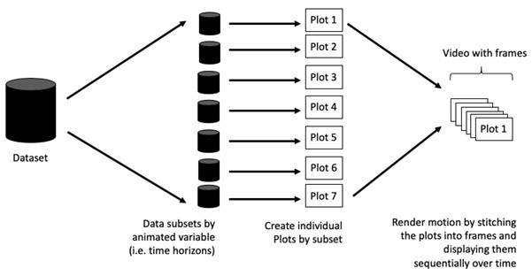
Before we dive into the steps for creating an animated statistical graph, it’s important to understand some of the key concepts and terminology related to this type of visualization.
Frame: In an animated line graph, each frame represents a different point in time or a different category. When the frame changes, the data points on the graph are updated to reflect the new data.
Animation Attributes: The animation attributes are the settings that control how the animation behaves. For example, you can specify the duration of each frame, the easing function used to transition between frames, and whether to start the animation from the current frame or from the beginning.
Before you start making animated graphs, you should first ask yourself: Does it makes sense to go through the effort? If you are conducting an exploratory data analysis, a animated graphic may not be worth the time investment. However, if you are giving a presentation, a few well-placed animated graphics can help an audience connect with your topic remarkably better than static counterparts.
First, write a code chunk to check, install and load the following R packages:
- plotly, R library for plotting interactive statistical graphs.
- gganimate, an ggplot extension for creating animated statistical graphs.
- gifski converts video frames to GIF animations using pngquant’s fancy features for efficient cross-frame palettes and temporal dithering. It produces animated GIFs that use thousands of colors per frame.
- gapminder: An excerpt of the data available at Gapminder.org. We just want to use its country_colors scheme.
- tidyverse, a family of modern R packages specially designed to support data science, analysis and communication task including creating static statistical graphs.
pacman::p_load(readxl, gifski, gapminder, plotly, gganimate, tidyverse)In this hands-on exercise, the Data worksheet from GlobalPopulation Excel workbook will be used.
Write a code chunk to import Data worksheet from GlobalPopulation Excel workbook by using appropriate R package from tidyverse family.
col <- c("Country", "Continent")
globalPop <- read_xls("data/GlobalPopulation.xls",
sheet="Data") %>%
mutate_each_(funs(factor(.)), col) %>%
mutate(Year = as.integer(Year))read_xls()of readxl package is used to import the Excel worksheet.mutate_each_()of dplyr package is used to convert all character data type into factor.mutateof dplyr package is used to convert data values of Year field into integer.
Unfortunately, mutate_each_() was deprecated in dplyr 0.7.0. and funs() was deprecated in dplyr 0.8.0. In view of this, we will re-write the code by using mutate_at() as shown in the code chunk below.
col <- c("Country", "Continent")
globalPop <- read_xls("data/GlobalPopulation.xls",
sheet="Data") %>%
mutate_at(col, as.factor) %>%
mutate(Year = as.integer(Year))Instead of using mutate_at(), across() can be used to derive the same outputs.
col <- c("Country", "Continent")
globalPop <- read_xls("data/GlobalPopulation.xls",
sheet="Data") %>%
mutate(across(all_of(col), as.factor)) %>%
mutate(Year = as.integer(Year))gganimate extends the grammar of graphics as implemented by ggplot2 to include the description of animation. It does this by providing a range of new grammar classes that can be added to the plot object in order to customise how it should change with time.
transition_*()defines how the data should be spread out and how it relates to itself across time.view_*()defines how the positional scales should change along the animation.shadow_*()defines how data from other points in time should be presented in the given point in time.enter_*()/exit_*()defines how new data should appear and how old data should disappear during the course of the animation.ease_aes()defines how different aesthetics should be eased during transitions.
In the code chunk below, the basic ggplot2 functions are used to create a static bubble plot.
ggplot(globalPop, aes(x = Old, y = Young,
size = Population,
colour = Country)) +
geom_point(alpha = 0.7,
show.legend = FALSE) +
scale_colour_manual(values = country_colors) +
scale_size(range = c(2, 12)) +
labs(title = 'Year: {frame_time}',
x = '% Aged',
y = '% Young') 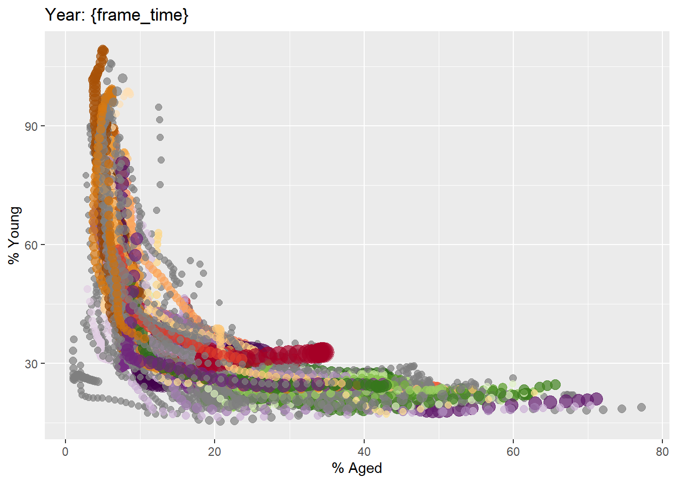
In the code chunk below,
transition_time()of gganimate is used to create transition through distinct states in time (i.e. Year).ease_aes()is used to control easing of aesthetics. The default islinear. Other methods are: quadratic, cubic, quartic, quintic, sine, circular, exponential, elastic, back, and bounce.
ggplot(globalPop, aes(x = Old, y = Young,
size = Population,
colour = Country)) +
geom_point(alpha = 0.7,
show.legend = FALSE) +
scale_colour_manual(values = country_colors) +
scale_size(range = c(2, 12)) +
labs(title = 'Year: {frame_time}',
x = '% Aged',
y = '% Young') +
transition_time(Year) +
ease_aes('linear') 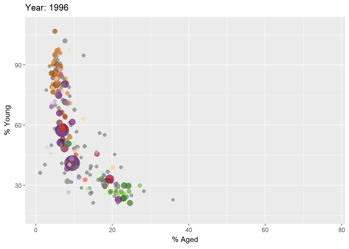
In Plotly R package, both ggplotly() and plot_ly() support key frame animations through the frame argument/aesthetic. They also support an ids argument/aesthetic to ensure smooth transitions between objects with the same id (which helps facilitate object constancy).
In this sub-section, you will learn how to create an animated bubble plot by using ggplotly() method.
gg <- ggplot(globalPop,
aes(x = Old,
y = Young,
size = Population,
colour = Country)) +
geom_point(aes(size = Population,
frame = Year),
alpha = 0.7,
show.legend = FALSE) +
scale_colour_manual(values = country_colors) +
scale_size(range = c(2, 12)) +
labs(x = '% Aged',
y = '% Young')
ggplotly(gg)- Appropriate ggplot2 functions are used to create a static bubble plot. The output is then saved as an R object called gg.
ggplotly()is then used to convert the R graphic object into an animated svg object.
Notice that although show.legend = FALSE argument was used, the legend still appears on the plot. To overcome this problem, theme(legend.position='none') should be used as shown in the plot and code chunk below.
unique_countries <- unique(globalPop$Country)
country_colors <- setNames(RColorBrewer::brewer.pal(length(unique_countries), "Paired")[1:length(unique_countries)],
unique_countries)
plot_ly(globalPop,
x = ~Old,
y = ~Young,
size = ~Population,
color = ~Country,
frame = ~Year,
type = 'scatter',
mode = 'markers',
sizes = c(10, 60),
text = ~paste("Country:", Country,
"<br>Year:", Year,
"<br>% Aged:", Old,
"<br>% Young:", Young,
"<br>Population:", format(Population, big.mark = ",")),
hoverinfo = "text",
marker = list(opacity = 0.7, sizemode = "diameter")) %>%
layout(title = "Global Population: % Aged vs % Young",
xaxis = list(title = "% Aged", range = c(0, 80)),
yaxis = list(title = "% Young", range = c(0, 100)),
showlegend = TRUE) %>%
animation_opts(
frame = 1000,
transition = 0,
redraw = TRUE
) %>%
animation_slider(
currentvalue = list(prefix = "Year: ")
) %>%
animation_button(label = "Play")In this sub-section, you will learn how to create an animated bubble plot by using plot_ly() method.
bp <- globalPop %>%
plot_ly(x = ~Old,
y = ~Young,
size = ~Population,
color = ~Continent,
sizes = c(2, 100),
frame = ~Year,
text = ~Country,
hoverinfo = "text",
type = 'scatter',
mode = 'markers'
) %>%
layout(showlegend = FALSE)
bp- Getting Started
- Visit this link for a very interesting implementation of gganimate by your senior.
- Building an animation step-by-step with gganimate.
- Creating a composite gif with multiple gganimate panels